Mathematics
In a study of diabetic patients in a village, the following observations were noted :
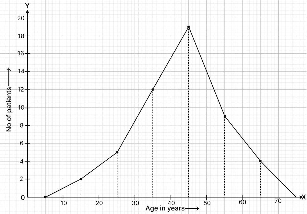
| Age in years | No. of patients |
|---|---|
| 10 - 20 | 2 |
| 20 - 30 | 5 |
| 30 - 40 | 12 |
| 40 - 50 | 19 |
| 50 - 60 | 9 |
| 60 - 70 | 4 |
Represent the above data by a frequency polygon.
Answer
Frequency distribution table :
| Age in years | Class marks | No. of patients |
|---|---|---|
| 10 - 20 | 15 | 2 |
| 20 - 30 | 25 | 5 |
| 30 - 40 | 35 | 12 |
| 40 - 50 | 45 | 19 |
| 50 - 60 | 55 | 9 |
| 60 - 70 | 65 | 4 |
Steps of construction of frequency polygon:
Take 2 cm along x-axis = 10 years.
Take 1 cm along y-axis = 2 patients.
Find the mid-points of class intervals.
Find points corresponding to given frequencies of classes and the mid-points of class intervals, and plot them.
Join consecutive points by line segments.
Join first end point with mid-point of class 0 - 10 with zero frequency and join the other end with mid point of class 70 - 80 with zero frequency.
The required frequency polygon is shown alongside.
Related Questions
The following table shows the number of illiterate persons in the age group (10 - 69) in a town
Age group (in years) No. of illiterate persons 10 - 19 50 20 - 29 125 30 - 39 190 40 - 49 275 50 - 59 340 60 - 69 410 Draw a histogram to represent the above data.
Draw a histogram to represent the following data :
Class mark Frequency 150 15 160 28 170 12 180 36 190 8 200 18 Draw a histogram to represent the above data.
The ages (in years) of 360 patients treated in a hospital on a particular day are given below :
Age in years No. of patients 10 - 20 90 20 - 30 40 30 - 40 60 40 - 50 20 50 - 60 120 60 - 70 30 Draw a histogram and a frequency polygon on the same graph to represent the above data.
Draw a histogram and the frequency polygon from the following data:
Class interval Frequency 20 - 25 30 25 - 30 24 30 - 35 52 35 - 40 28 40 - 45 46 45 - 50 10