
What would you do to find the most popular game among Naresh’s and Navya’s classmates?
Answer
The list prepared by Naresh and Navya is only a collection of names and games. It is not organised, so the most popular game cannot be seen at a glance.
To find the most popular game, we should organise the data as follows:
Write the name of each different game in a column.
Go through the list one entry at a time and put a tally mark ‘|’ against the game named in that entry. Every time the count of a game reaches 5, draw a line through the previous four marks.
Count the tally marks against each game to get its frequency, i.e., the number of students who like that game.
Compare the frequencies. The game having the highest frequency is the most popular game.
Hence, we should organise the given list into a frequency table using tally marks and then pick the game with the highest frequency.
What is the most popular game in their class?
Answer
Counting the entries of the list for each game, we get the frequency distribution table:
| Game | Tally Marks | Number of Students (Frequency) |
|---|---|---|
| Kabaddi | 6 | |
| Hockey | 8 | |
| Cricket | 6 | |
| Satoliya (Pittu) | 5 | |
| Football | |||| | 4 |
| Badminton | || | 2 |
| Total | 31 |
From the table, the highest frequency is 8, which is for hockey.
Hence, hockey is the most popular game in their class.
(So Naresh’s guess that cricket is the most popular game was not correct — cricket is liked by only 6 students.)
Pari wants to respond to the questions given below. Put a tick (✓) for the questions where she needs to carry out data collection and put a cross (✗) for the questions where she doesn’t need to collect data. Discuss your answers in the classroom.
(a) What is the most popular TV show among her classmates?
(b) When did India get independence?
(c) How much water is getting wasted in her locality?
(d) What is the capital of India?
Answer
(a) What is the most popular TV show among her classmates? ✓
The choices of her classmates are not already known, so Pari has to ask each classmate and collect the data.
(b) When did India get independence? ✗
This is a known historical fact (15th August, 1947). It can be found from a book, so no data collection is needed.
(c) How much water is getting wasted in her locality? ✓
Pari has to observe and measure the water being wasted at different places in her locality, so data collection is needed.
(d) What is the capital of India? ✗
This is a known fact (New Delhi). It can be found from a book or a map, so no data collection is needed.
Hence, Pari needs to collect data for questions (a) and (c) only.
Complete the table to help Shri Nilesh to purchase the correct numbers of sweets:
| Sweets | Tally Marks | No. of Students |
|---|---|---|
| Jalebi | 6 | |
| Gulab jamun | 9 | |
| Gujiya | ||
| Barfi | ||| | |
| Rasgulla |
(a) How many students chose jalebi?
(b) Barfi was chosen by students?
(c) How many students chose gujiya?
(d) Rasgulla was chosen by students?
(e) How many students chose gulab jamun?
Answer
Counting the tally marks against each sweet, the completed table is:
| Sweets | Tally Marks | No. of Students |
|---|---|---|
| Jalebi | 6 | |
| Gulab jamun | 9 | |
| Gujiya | 13 | |
| Barfi | ||| | 3 |
| Rasgulla | 7 | |
| Total | 38 |
(a) The tally marks for jalebi are |||| | , which stand for 5 + 1 = 6.
Hence, 6 students chose jalebi.
(b) The tally marks for barfi are ||| , which stand for 3.
Hence, barfi was chosen by 3 students.
(c) The tally marks for gujiya are |||| |||| ||| , which stand for 5 + 5 + 3 = 13.
Hence, 13 students chose gujiya.
(d) The tally marks for rasgulla are |||| || , which stand for 5 + 2 = 7.
Hence, rasgulla was chosen by 7 students.
(e) The tally marks for gulab jamun are |||| |||| , which stand for 5 + 4 = 9.
Hence, 9 students chose gulab jamun.
Is the above table sufficient to distribute each type of sweet to the correct student? Explain. If it is not sufficient, what is the alternative?
Answer
No, the above table is not sufficient to distribute each type of sweet to the correct student.
The table tells us only how many students chose each sweet. It does not tell us which student chose which sweet, because the names of the students were not recorded — only tally marks were put. So, while distributing, Shri Nilesh will not know whom to give a jalebi and whom to give a rasgulla.
The alternative is to record the data along with the names, that is, to prepare a list in which the name of every student is written against the sweet chosen by that student (or to write the names of the students under each sweet). Such a list gives both the count of each sweet and the choice of each individual student.
Hence, the table is not sufficient; a name-wise record of the choices should be prepared for the correct distribution.
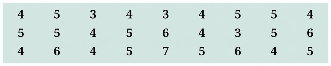
Help her to figure out the following:
(a) The largest shoe size in the class is ............... .
(b) The smallest shoe size in the class is ............... .
(c) There are ............... students who wear shoe size 5.
(d) There are ............... students who wear shoe sizes larger than 4.
Answer
The shoe sizes arranged in ascending order are:
3, 3, 3, 4, 4, 4, 4, 4, 4, 4, 4, 4, 5, 5, 5, 5, 5, 5, 5, 5, 5, 5, 6, 6, 6, 6, 7
(a) The last number in the sorted list is the largest value i.e., 7.
Hence, the largest shoe size in the class is 7.
(b) The first number in the sorted list is the smallest value i.e., 3.
Hence, the smallest shoe size in the class is 3.
(c) Counting the number of 5’s in the sorted list, we get 10.
Hence, there are 10 students who wear shoe size 5.
(d) Shoe sizes larger than 4 are 5, 6 and 7.
Number of students wearing these sizes = 10 + 4 + 1 = 15
Hence, there are 15 students who wear shoe sizes larger than 4.
How did arranging the data in ascending order help to answer these questions?
Answer
When the data is written just as it is collected, the sizes are scattered and we have to search the whole data again and again for every question.
On arranging the data in ascending order :
All equal sizes come together, so the number of students wearing a particular size can be counted easily without missing or repeating any value.
The smallest size is the first observation and the largest size is the last observation, so both can be read directly from the two ends of the list.
The sizes larger (or smaller) than a given size lie together on one side of the list, so they can be counted quickly.
Hence, arranging the data in ascending order organises it and makes counting and comparing the observations much easier.
Are there other ways to arrange the data?
Answer
Yes, the data can be arranged in other ways also. For example :
- In descending order :
7, 6, 6, 6, 6, 5, 5, 5, 5, 5, 5, 5, 5, 5, 5, 4, 4, 4, 4, 4, 4, 4, 4, 4, 3, 3, 3
- In the form of a frequency distribution table using tally marks :
| Shoe size | Tally Marks | Number of students (Frequency) |
|---|---|---|
| 3 | ||| | 3 |
| 4 | 9 | |
| 5 | 10 | |
| 6 | |||| | 4 |
| 7 | | | 1 |
| Total | 27 |
The data can also be shown as a pictograph or a bar graph.
Hence, besides ascending order, the data can be arranged in descending order or organised in a frequency distribution table (and it can also be presented as a pictograph or a bar graph).
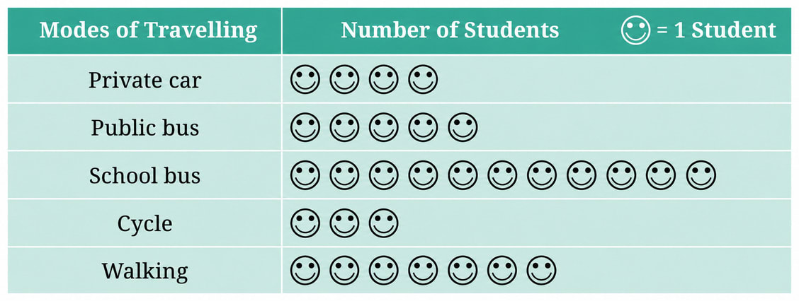
This picture helps you understand at a glance the different modes of travel used by students. Based on this picture, answer the following questions:
(i) Which mode of travel is used by the most number of students?
(ii) Which mode of travel is used by the least number of students?
Answer
(i) In the given pictograph, one symbol stands for 1 student.
Counting the symbols in each row, we get:
| Modes of Travelling | Number of Students |
|---|---|
| Private car | 4 |
| Public bus | 5 |
| School bus | 11 |
| Cycle | 3 |
| Walking | 7 |
The longest row of symbols is that of the school bus, which has 11 symbols.
Hence, the school bus is the mode of travel used by the greatest number of students, i.e., 11 students.
(ii) From the pictograph, the shortest row of symbols is that of the cycle, which has only 3 symbols.
Hence, the cycle is the mode of travel used by the least number of students, i.e., 3 students.
What could be the problems faced in preparing such a pictograph, if the total number of students present in a class is 33 or 27?
Answer
In Sangita's pictograph, one symbol represents 10 students and half a symbol represents 5 students.
Number of symbols needed =
For 33 students :
So 3 complete symbols and of a symbol have to be drawn.
For 27 students :
So 2 complete symbols and of a symbol have to be drawn.
The problems faced are:
The numbers 33 and 27 are not multiples of 10, so the leftover 3 students and 7 students cannot be shown by a complete symbol.
A part of a symbol such as or is very hard to draw accurately, since these parts are not as simple as a half.
Even if such a part is drawn somehow, a reader looking at the pictograph cannot tell whether the part shown is or of a symbol. So the pictograph would give a wrong count.
∴ Hence, a scale of one symbol = 10 students works neatly only when the frequencies are multiples of 10 (or of 5, if half a symbol is also used); for 33 and 27 students, awkward parts of a symbol would have to be drawn, which is difficult and misleading.
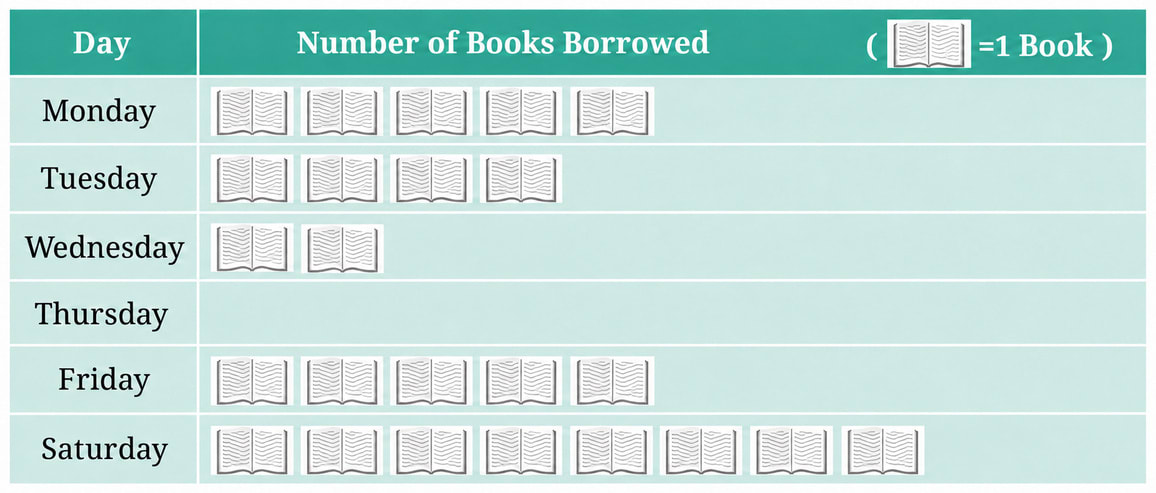
The following pictograph shows the number of books borrowed by students, in a week, from the library of Middle School, Ginnori:
(a) On which day were the minimum number of books borrowed?
(b) What was the total number of books borrowed during the week?
(c) On which day were the maximum number of books borrowed? What may be the possible reason?
Answer
In the given pictograph, one symbol stands for 1 book.
Counting the symbols in each row, we get:
| Day | Number of Books Borrowed |
|---|---|
| Monday | 5 |
| Tuesday | 4 |
| Wednesday | 2 |
| Thursday | 0 |
| Friday | 5 |
| Saturday | 8 |
(a) The row for Thursday has no symbol at all, so no book was borrowed on Thursday.
Hence, the minimum number of books were borrowed on Thursday.
(b) Total number of books borrowed during the week
= 5 + 4 + 2 + 0 + 5 + 8
= 24
Hence, the total number of books borrowed during the week is 24.
(c) The row for Saturday has the greatest number of symbols, i.e., 8 symbols.
A possible reason is that Sunday is a holiday. Students get free time at home over the weekend, so they borrow more books on Saturday to read during the holiday.
Hence, the maximum number of books, i.e., 8 books, were borrowed on Saturday, possibly because the students wanted books to read during the Sunday holiday.
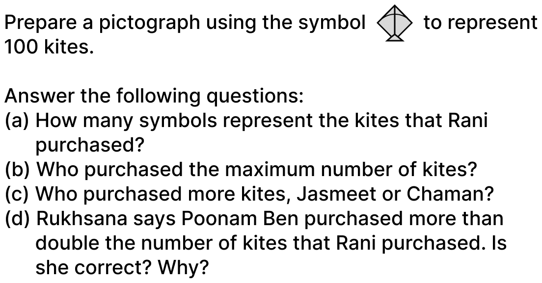
Magan Bhai sells kites at Jamnagar. Six shopkeepers from nearby villages come to purchase kites from him. The number of kites he sold to these six shopkeepers are given below —
| Shopkeeper | Number of Kites Sold |
|---|---|
| Chaman | 250 |
| Rani | 300 |
| Rukhsana | 100 |
| Jasmeet | 450 |
| Jetha Lal | 250 |
| Poonam Ben | 700 |
Answer
Here, one symbol represents 100 kites. So half a symbol represents 50 kites.
Number of symbols =
Calculating the number of symbols for each shopkeeper, we get:
| Shopkeeper | Number of Kites Sold | Number of Symbols |
|---|---|---|
| Chaman | 250 | |
| Rani | 300 | |
| Rukhsana | 100 | |
| Jasmeet | 450 | |
| Jetha Lal | 250 | |
| Poonam Ben | 700 |
Drawing this many symbols against each shopkeeper, the required pictograph is:
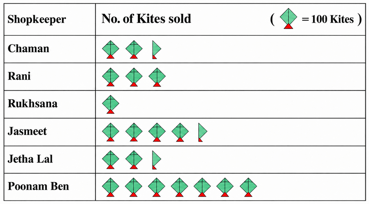
(a) Number of kites purchased by Rani = 300
Number of symbols = = 3
Hence, 3 symbols represent the kites that Rani purchased.
(b) Comparing the numbers 250, 300, 100, 450, 250 and 700, the greatest number is 700, which is against Poonam Ben. In the pictograph, hers is the longest row with 7 symbols.
Hence, Poonam Ben purchased the maximum number of kites, i.e., 700 kites.
(c) Number of kites purchased by Jasmeet = 450
Number of kites purchased by Chaman = 250
Since 450 > 250,
Hence, Jasmeet purchased more kites than Chaman.
(d) Number of kites purchased by Rani = 300
Double the number of kites purchased by Rani = 2 × 300 = 600
Number of kites purchased by Poonam Ben = 700
Since 700 > 600, Poonam Ben purchased more than double the number of kites purchased by Rani.
⇒ 700 - 600 = 100, i.e., Poonam Ben purchased 100 kites more than twice the number purchased by Rani.
Hence, Rukhsana is correct because Poonam Ben purchased 700 kites, which is 100 more than twice Rani's 300 kites.
Answer the following questions using the bar graph:
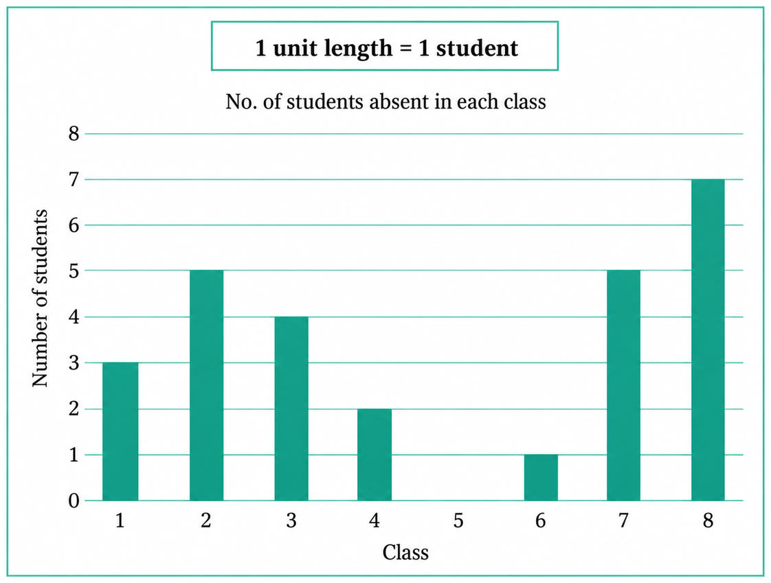
(i) In Class 2, ............... students were absent that day.
(ii) In which class were the maximum number of students absent? ...............
(iii) Which class had full attendance that day? ...............
Answer
(i) In the given bar graph, 1 unit length = 1 student.
The bar drawn for Class 2 rises up to the horizontal line marked 5.
∴ Number of students absent in Class 2 = 5 × 1 = 5
Hence, in Class 2, 5 students were absent that day.
(ii) The maximum number of students absent is shown by the longest (tallest) bar.
The tallest bar in the graph is the bar drawn for Class 8, and it rises up to the horizontal line marked 7.
∴ Number of students absent in Class 8 = 7
Hence, the maximum number of students (7 students) were absent in Class 8.
(iii) A class has full attendance when no student of that class is absent, that is, when the height of its bar is 0 units.
In the bar graph, no bar is drawn for Class 5, which means the number of students absent in Class 5 is 0.
Hence, Class 5 had full attendance that day.
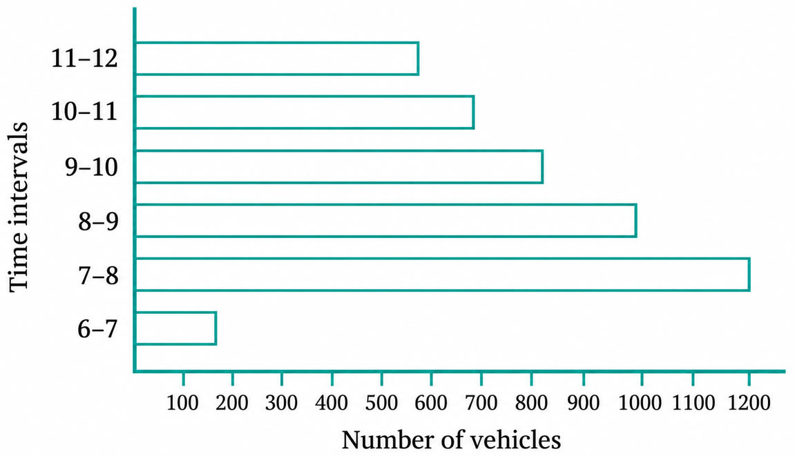
How many total cars passed through the crossing between 6 a.m. and noon?
Answer
In the given bar graph, one unit of length stands for 100 vehicles.
Reading the length of each bar, we get:
| Time interval | Number of vehicles |
|---|---|
| 6–7 a.m. | 150 |
| 7–8 a.m. | 1200 |
| 8–9 a.m. | 1000 |
| 9–10 a.m. | 800 |
| 10–11 a.m. | 700 |
| 11 a.m.–12 noon | 600 |
Total number of vehicles = Sum of the vehicles in all the six time intervals
= 150 + 1200 + 1000 + 800 + 700 + 600
= 4450
Hence, about 4450 vehicles passed through the crossing between 6 a.m. and noon.
Why do you think so little traffic occurred during the hour of 6–7 a.m., as compared to the other hours from 7 a.m.–noon?
Answer
6–7 a.m. is very early in the morning. At that hour most people are still at home, and schools, offices, shops and markets have not yet opened. So very few people need to travel at that time, and only about 150 vehicles passed through the crossing.
Hence, the traffic was very little between 6–7 a.m. because it is an early morning hour when schools, offices and shops are still closed and very few people travel.
Why do you think the traffic was the heaviest between 7–8 a.m.?
Answer
7–8 a.m. is the hour during which schools and offices begin. Students travelling to school, and people travelling to their workplaces, are all on the road at the same time. This is why the largest number of vehicles, 1200, passed through the crossing during this hour.
Hence, the traffic was the heaviest between 7–8 a.m. because it is the rush hour when most students and working people leave for their schools and offices.
Why do you think the traffic was lesser and lesser each hour after 8 a.m. all the way until noon?
Answer
By 8 a.m. most students and working people have already reached their schools and offices. After that hour, fewer and fewer people are still travelling, so the rush keeps reducing. This is seen in the bar graph, where the number of vehicles falls steadily from 1000 in 8–9 a.m. to 800, then 700, and finally 600 in 11 a.m.–12 noon.
Hence, the traffic became lesser and lesser each hour after 8 a.m. because by then most people had already reached their schools and workplaces, so fewer people were left travelling.
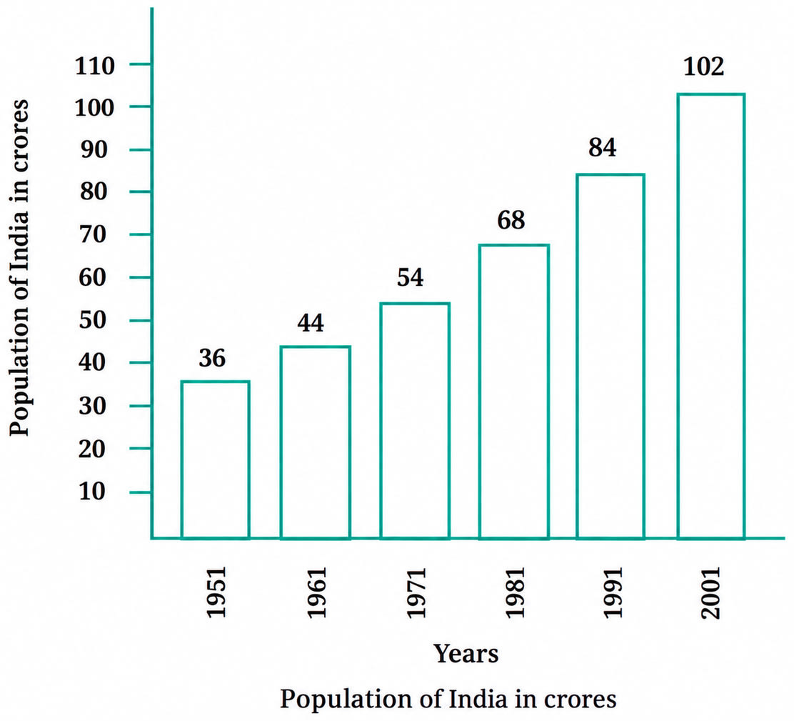
(a) On the basis of this bar graph, what may be a few questions you may ask your friends?
(b) How much did the population of India increase over 50 years? How much did the population increase in each decade?
Answer
(a) The bar graph shows the population of India (in crores) in each decade from 1951 to 2001. A few questions that may be asked are:
(i) In which year was the population of India the least?
(ii) In which year was the population of India the highest?
(iii) What was the population of India in 1971?
(iv) In which decade did the population of India cross 100 crores?
(v) By how much did the population increase between 1981 and 1991?
(vi) In which decade was the increase in population the smallest?
Hence, the above are a few questions that may be asked on the basis of the given bar graph.
(b) In the given bar graph, 1 unit length = 10 crores.
Reading the bars, the population of India (in crores) is:
| Year | Population (in crores) |
|---|---|
| 1951 | 36 |
| 1961 | 44 |
| 1971 | 54 |
| 1981 | 68 |
| 1991 | 84 |
| 2001 | 102 |
Increase over 50 years :
Increase in population = Population in 2001 - Population in 1951
= 102 crores - 36 crores
= 66 crores
Hence, the population of India increased by 66 crores over the 50 years from 1951 to 2001.
Increase in each decade :
Increase in a decade = Population at the end of the decade - Population at the beginning of the decade
1951–1961 : 44 - 36 = 8 crores
1961–1971 : 54 - 44 = 10 crores
1971–1981 : 68 - 54 = 14 crores
1981–1991 : 84 - 68 = 16 crores
1991–2001 : 102 - 84 = 18 crores
The decade-wise increase is shown below :
| Decade | Increase in population (in crores) |
|---|---|
| 1951–1961 | 8 |
| 1961–1971 | 10 |
| 1971–1981 | 14 |
| 1981–1991 | 16 |
| 1991–2001 | 18 |
| Total | 66 |
Hence, the population of India increased by 8 crores, 10 crores, 14 crores, 16 crores and 18 crores in the decades 1951–1961, 1961–1971, 1971–1981, 1981–1991 and 1991–2001 respectively, which together make an increase of 66 crores over the 50 years.
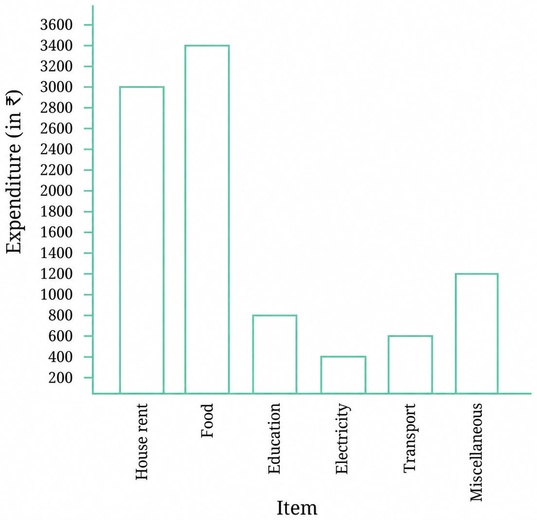
Use the bar graph to answer the following questions:
(a) On which item does Imran’s family spend the most and the second most?
(b) Is the cost of electricity about one-half the cost of education?
(c) Is the cost of education less than one-fourth the cost of food?
Answer
(a) From the bar graph, the height of each bar gives the monthly expenditure on that item :
| Item | Expenditure (in ₹) |
|---|---|
| House rent | 3000 |
| Food | 3400 |
| Education | 800 |
| Electricity | 400 |
| Transport | 600 |
| Miscellaneous | 1200 |
The longest bar is the bar for food, which stands for ₹ 3400.
The second longest bar is the bar for house rent, which stands for ₹ 3000.
Hence, Imran’s family spends the most on food and the second most on house rent.
(b) From the bar graph,
Cost of electricity = ₹ 400
Cost of education = ₹ 800
One-half of the cost of education = × ₹ 800
= ₹ 400
Since ₹ 400 = ₹ 400, the cost of electricity is exactly one-half the cost of education.
Hence, yes, the cost of electricity is about one-half (in fact, exactly one-half) the cost of education.
(c) From the bar graph,
Cost of education = ₹ 800
Cost of food = ₹ 3400
One-fourth of the cost of food = × ₹ 3400
= ₹ 850
Comparing, ₹ 800 < ₹ 850.
Hence, yes, the cost of education is less than one-fourth the cost of food.
Samantha visited a tea garden, and collected data of the insects and critters she saw there. Here is the data she collected:
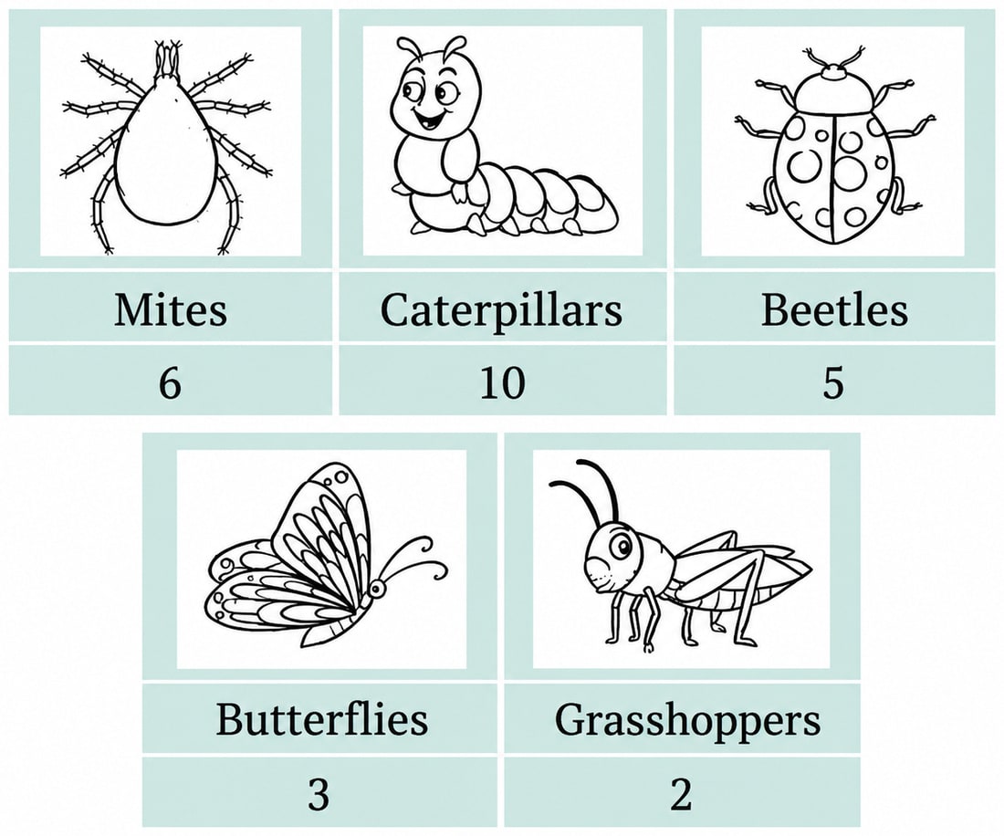
Help her prepare a bar graph representing this data.
Answer
To draw the bar graph, we follow these steps :
Draw a horizontal line and a vertical line meeting at a point. Along the horizontal line, mark the insects and critters — Mites, Caterpillars, Beetles, Butterflies and Grasshoppers — with equal spacing between them. Along the vertical line, mark the number of insects and critters.
Choose a suitable scale. Here the largest frequency is 10, which is small, so we take 1 unit length = 1 insect or critter.
Draw bars of the same width with a uniform gap between them, taking the height of each bar equal to the frequency of that category :
| Insect / critter | Number seen | Height of bar |
|---|---|---|
| Mites | 6 | 6 units |
| Caterpillars | 10 | 10 units |
| Beetles | 5 | 5 units |
| Butterflies | 3 | 3 units |
| Grasshoppers | 2 | 2 units |
The required bar graph is shown below :
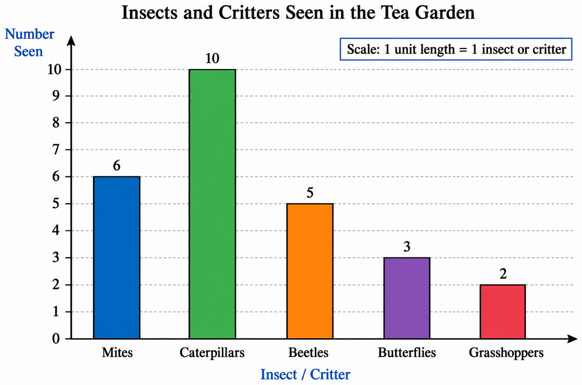
Hence, the bar graph representing Samantha’s data is as drawn above, with the scale 1 unit length = 1 insect or critter.
Pooja collected data on the number of tickets sold at the Bhopal railway station for a few different cities of Madhya Pradesh over a two-hour period.
| City | Vidisha | Jabalpur | Seoni | Indore | Sagar |
|---|---|---|---|---|---|
| Number of tickets | 24 | 20 | 16 | 28 | 16 |
She used this data and prepared a bar graph on the board to discuss the data with her students, but someone erased a portion of the graph.
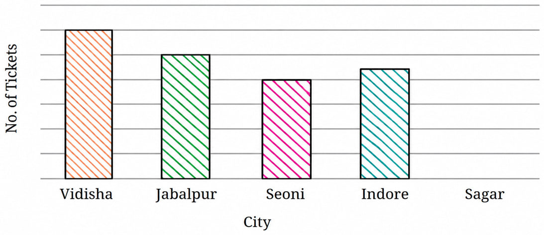
(a) Write the number of tickets sold for Vidisha above the bar.
(b) Write the number of tickets sold for Jabalpur above the bar.
(c) The bar for Vidisha is 6 unit lengths and the bar for Jabalpur is 5 unit lengths. What is the scale for this graph?
(d) Draw the correct bar for Sagar.
(e) Add the scale of the bar graph by placing the correct numbers on the vertical axis.
(f) Are the bars for Seoni and Indore correct in this graph? If not, draw the correct bar(s).
Answer
(a)
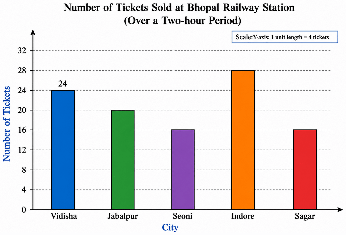
From the given table, the number of tickets sold for Vidisha is 24.
(b)
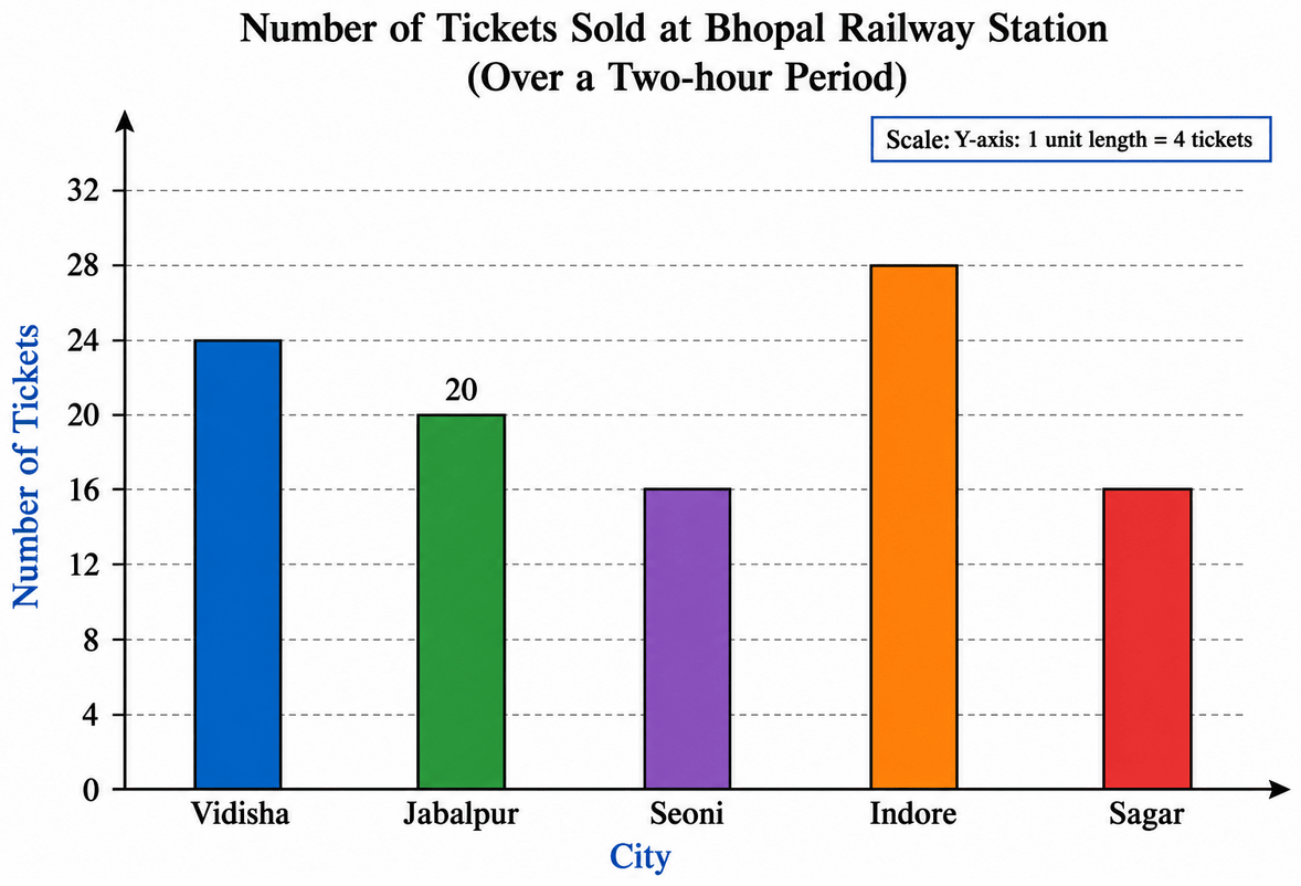
From the given table, the number of tickets sold for Jabalpur is 20.
(c) The bar for Vidisha is 6 unit lengths and it stands for 24 tickets.
1 unit length =
=
= 4 tickets
Checking with Jabalpur, the bar is 5 unit lengths.
Number of tickets = 5 × 4 = 20, which agrees with the table.
Hence, the scale for this graph is 1 unit length = 4 tickets.
(d) Number of tickets sold for Sagar = 16
Height of the bar = = 4 unit lengths
So, a bar of 4 unit lengths is drawn above Sagar, of the same width as the other bars and with the same gap between them.
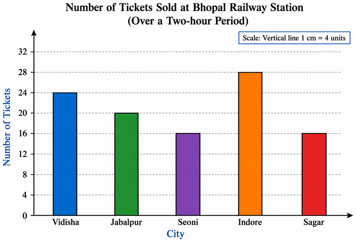
Hence, the bar for Sagar is 4 unit lengths tall.
(e) Since 1 unit length = 4 tickets, the markings on the vertical axis start from 0 and go up in steps of 4.
The numbers to be written on the vertical axis are:
0, 4, 8, 12, 16, 20, 24, 28
Hence, the vertical axis is marked as 0, 4, 8, 12, 16, 20, 24 and 28.
(f) For Seoni, the number of tickets sold = 16
Required height of the bar = = 4 unit lengths
In the graph, the bar for Seoni is 4 unit lengths tall. So, the bar for Seoni is correct.
For Indore, the number of tickets sold = 28
Required height of the bar = = 7 unit lengths
In the graph, the bar for Indore is less than 5 unit lengths tall. So, the bar for Indore is not correct.
The bar for Indore has to be redrawn with a height of 7 unit lengths, which makes it the tallest bar in the graph.
Hence, the bar for Seoni is correct, but the bar for Indore is not correct and must be redrawn as 7 unit lengths.
Chinu listed the various means of transport that passed across the road in front of his house from 9 a.m. to 10 a.m.:
| bike | car | bike | bus | bike | bike |
| bike | auto rickshaw | bicycle | bullock cart | bicycle | auto rickshaw |
| car | scooter | car | auto rickshaw | bicycle | bike |
| car | auto rickshaw | bike | scooter | bike | car |
| bicycle | scooter | bicycle | scooter | bike | bus |
| auto rickshaw | auto rickshaw | bike | bicycle | bus | bike |
| bicycle | scooter | bus | scooter | auto rickshaw | bike |
| scooter | bicycle | bike | bullock cart | auto rickshaw | scooter |
| car | scooter |
(a) Prepare a frequency distribution table for the data.
(b) Which means of transport was used the most?
(c) If you were there to collect this data, how could you do it? Write the steps or process.
Answer
(a) We go through the list one entry at a time and put a tally mark ‘|’ against the corresponding means of transport. When the count reaches 5, we draw a line through the previous four marks.
The frequency distribution table is:
| Means of transport | Tally Marks | Number of vehicles (Frequency) |
|---|---|---|
| Bike | 13 | |
| Car | 6 | |
| Bus | |||| | 4 |
| Auto rickshaw | 8 | |
| Bicycle | 8 | |
| Bullock cart | || | 2 |
| Scooter | 9 | |
| Total | 50 |
Hence, the frequency distribution table for Chinu’s data is as shown above, and 50 vehicles passed in all.
(b) Comparing the frequencies 13, 6, 4, 8, 8, 2 and 9, the largest frequency is 13, which is the frequency of bikes.
Hence, the bike was the means of transport used the most.
(c) The steps to collect this data are:
Fix the place and the time. Choose a spot from where the whole road is clearly visible, and fix the one-hour period, 9 a.m. to 10 a.m., during which the observations will be made.
Decide the categories. List the different means of transport likely to pass by — bike, car, bus, auto rickshaw, bicycle, bullock cart, scooter — and keep a column named ‘any other’ for a vehicle that does not fit these categories.
Prepare a blank table beforehand, with one row for each means of transport and columns for tally marks and frequency.
Observe and record. Watch the road continuously, and as each vehicle passes, put a tally mark ‘|’ in the row of that means of transport. Drawing a line through every group of four marks after the fifth one makes counting easier later.
Count the tally marks at the end of the hour and write the frequency of each means of transport in the last column.
Check the work by adding all the frequencies. The sum should be equal to the total number of vehicles observed.
Hence, the data can be collected by observing the road for the fixed hour and recording each passing vehicle with tally marks in a prepared table.
Faiz prepared a frequency distribution table of data on the number of wickets taken by Jaspreet Bumrah in his last 30 matches:
| Wickets Taken | Number of Matches |
|---|---|
| 0 | 2 |
| 1 | 4 |
| 2 | 6 |
| 3 | 8 |
| 4 | 3 |
| 5 | 5 |
| 6 | 1 |
| 7 | 1 |
(a) What information is this table giving?
(b) What may be the title of this table?
(c) What caught your attention in this table?
(d) In how many matches has Bumrah taken 4 wickets?
(e) Mayank says, “If we want to know the total number of wickets he has taken in his last 30 matches, we have to add the numbers 0, 1, 2, 3 …, up to 7.” Can Mayank get the total number of wickets taken in this way? Why?
(f) How would you correctly figure out the total number of wickets taken by Bumrah in his last 30 matches, using this table?
Answer
(a) The first column of the table lists the possible number of wickets taken by Bumrah in a match, and the second column tells in how many of his last 30 matches he took that number of wickets. For example, the row ‘2 — 6’ means that there were 6 matches in which he took exactly 2 wickets.
Hence, the table gives the number of matches in which Bumrah took 0, 1, 2, 3, 4, 5, 6 and 7 wickets, out of his last 30 matches.
(b) Hence, a suitable title for this table is “Number of Wickets Taken by Jaspreet Bumrah in his Last 30 Matches”.
(c) Some of the things that catch our attention in this table are:
The frequencies add up to 2 + 4 + 6 + 8 + 3 + 5 + 1 + 1 = 30, which is exactly the number of matches considered.
The largest frequency is 8, so taking 3 wickets in a match is the most common performance.
There are only 2 matches in which he took no wicket at all, so he took at least one wicket in 30 - 2 = 28 of the 30 matches.
Taking 6 wickets and taking 7 wickets happened in only 1 match each, so such performances are rare.
Hence, the table shows that Bumrah most often took 3 wickets in a match, and that he failed to take a wicket in only 2 out of 30 matches.
(d) From the table, the frequency written against 4 wickets is 3.
Hence, Bumrah has taken 4 wickets in 3 matches.
(e) No, Mayank cannot get the total number of wickets in this way.
Adding 0 + 1 + 2 + 3 + 4 + 5 + 6 + 7 = 28 only adds up the entries of the first column, which are the different possible numbers of wickets in a match. It does not take into account how many matches correspond to each of these entries.
For example, he took 3 wickets in 8 different matches, so 3 must be counted 8 times and not just once. Mayank’s method counts each entry only once.
Hence, Mayank cannot find the total number of wickets by adding 0, 1, 2, 3, …, up to 7.
(f) To find the total number of wickets, we multiply each number of wickets by the number of matches in which that many wickets were taken, and then add all these products.
| Wickets taken | Number of matches | Wickets taken × Number of matches |
|---|---|---|
| 0 | 2 | 0 |
| 1 | 4 | 4 |
| 2 | 6 | 12 |
| 3 | 8 | 24 |
| 4 | 3 | 12 |
| 5 | 5 | 25 |
| 6 | 1 | 6 |
| 7 | 1 | 7 |
| Total | 30 | 90 |
Total number of wickets
= (0 × 2) + (1 × 4) + (2 × 6) + (3 × 8) + (4 × 3) + (5 × 5) + (6 × 1) + (7 × 1)
= 0 + 4 + 12 + 24 + 12 + 25 + 6 + 7
= 90
Hence, Bumrah took 90 wickets in his last 30 matches.
The following pictograph shows the number of tractors in five different villages.
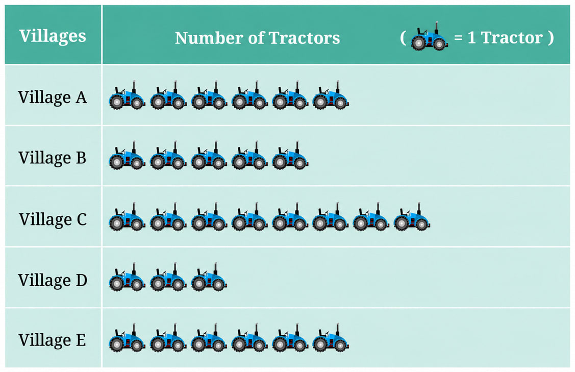
Observe the pictograph and answer the following questions—
(a) Which village has the smallest number of tractors?
(b) Which village has the most tractors?
(c) How many more tractors does Village C have than Village B?
(d) Komal says, “Village D has half the number of tractors as Village E.” Is she right?
Answer
In the pictograph, one symbol stands for 1 tractor. Counting the symbols in each row, we get:
| Village | Number of symbols | Number of tractors |
|---|---|---|
| Village A | 6 | 6 |
| Village B | 5 | 5 |
| Village C | 8 | 8 |
| Village D | 3 | 3 |
| Village E | 6 | 6 |
(a) Comparing 6, 5, 8, 3 and 6, the smallest number is 3, which belongs to Village D.
Hence, Village D has the smallest number of tractors.
(b) Comparing 6, 5, 8, 3 and 6, the largest number is 8, which belongs to Village C.
Hence, Village C has the most tractors.
(c) Number of tractors in Village C = 8
Number of tractors in Village B = 5
Difference = 8 - 5
= 3
Hence, Village C has 3 more tractors than Village B.
(d) Number of tractors in Village D = 3
Number of tractors in Village E = 6
Half the number of tractors in Village E = × 6
= 3
Since 3 = 3, the number of tractors in Village D is indeed half the number in Village E.
Hence, yes, Komal is right.
The number of girl students in each class of a school is depicted by the pictograph:
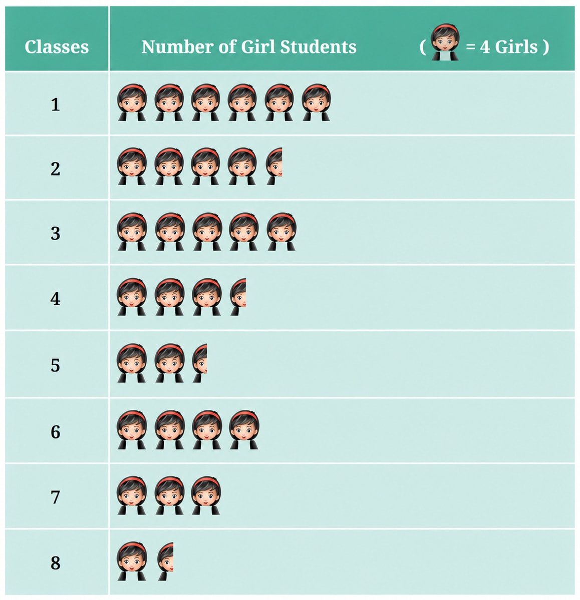
Observe this pictograph and answer the following questions:
(a) Which class has the least number of girl students?
(b) What is the difference between the number of girls in Classes 5 and 6?
(c) If two more girls were admitted in Class 2, how would the graph change?
(d) How many girls are there in Class 7?
Answer
In the pictograph, one complete symbol stands for 4 girls, so a half symbol stands for × 4 = 2 girls.
Counting the symbols in each row, we get:
| Class | Number of symbols | Number of girl students |
|---|---|---|
| 1 | 6 | 6 × 4 = 24 |
| 2 | 4 and a half | (4 × 4) + 2 = 18 |
| 3 | 5 | 5 × 4 = 20 |
| 4 | 3 and a half | (3 × 4) + 2 = 14 |
| 5 | 2 and a half | (2 × 4) + 2 = 10 |
| 6 | 4 | 4 × 4 = 16 |
| 7 | 3 | 3 × 4 = 12 |
| 8 | 1 and a half | (1 × 4) + 2 = 6 |
(a) Comparing 24, 18, 20, 14, 10, 16, 12 and 6, the smallest number is 6, which belongs to Class 8. It also has the shortest row of symbols in the pictograph.
Hence, Class 8 has the least number of girl students.
(b) Number of girls in Class 5 = 10
Number of girls in Class 6 = 16
Difference = 16 - 10
= 6
Hence, the difference between the number of girls in Classes 5 and 6 is 6.
(c) Number of girls in Class 2 at present = 18
Number of girls after two more are admitted = 18 + 2
= 20
Number of symbols needed = = 5
At present the row for Class 2 has 4 complete symbols and 1 half symbol. After the admission, the half symbol would become a complete symbol.
Hence, the row for Class 2 would show 5 complete symbols instead of 4 complete symbols and a half symbol.
(d) Number of symbols in the row for Class 7 = 3
Number of girls = 3 × 4
= 12
Hence, there are 12 girls in Class 7.
Mudhol Hounds (a type of breed of Indian dogs) are largely found in North Karnataka’s Bagalkote and Vijaypura districts. The government took an initiative to protect this breed by providing support to those who adopted these dogs. Due to this initiative, the number of these dogs increased. The number of Mudhol dogs in six villages of Karnataka are as follows—
Village A : 18, Village B : 36, Village C : 12, Village D : 48, Village E : 18, Village F : 24
Prepare a pictograph and answer the following questions:
(a) What will be a useful scale or key to draw this pictograph?
(b) How many symbols will you use to represent the dogs in Village B?
(c) Kamini said that the number of these dogs in Village B and Village D together will be more than the number of these dogs in the other 4 villages. Is she right? Give reasons for your response.
Answer
(a) The given numbers of dogs are 18, 36, 12, 48, 18 and 24.
Each of these numbers is a multiple of 6 :
18 = 6 × 3, 36 = 6 × 6, 12 = 6 × 2, 48 = 6 × 8, 18 = 6 × 3, 24 = 6 × 4
So, if we let one symbol stand for 6 dogs, every village can be shown by a whole number of symbols and no symbol has to be cut into parts. The numbers are not too large either, so the pictograph will fit nicely in the page.
Hence, a useful scale (key) is: one symbol = 6 dogs.
Using this key, the number of symbols needed for each village is:
| Village | Number of dogs | Number of symbols (1 symbol = 6 dogs) |
|---|---|---|
| Village A | 18 | 18 ÷ 6 = 3 |
| Village B | 36 | 36 ÷ 6 = 6 |
| Village C | 12 | 12 ÷ 6 = 2 |
| Village D | 48 | 48 ÷ 6 = 8 |
| Village E | 18 | 18 ÷ 6 = 3 |
| Village F | 24 | 24 ÷ 6 = 4 |
The pictograph drawn with this key is shown below :
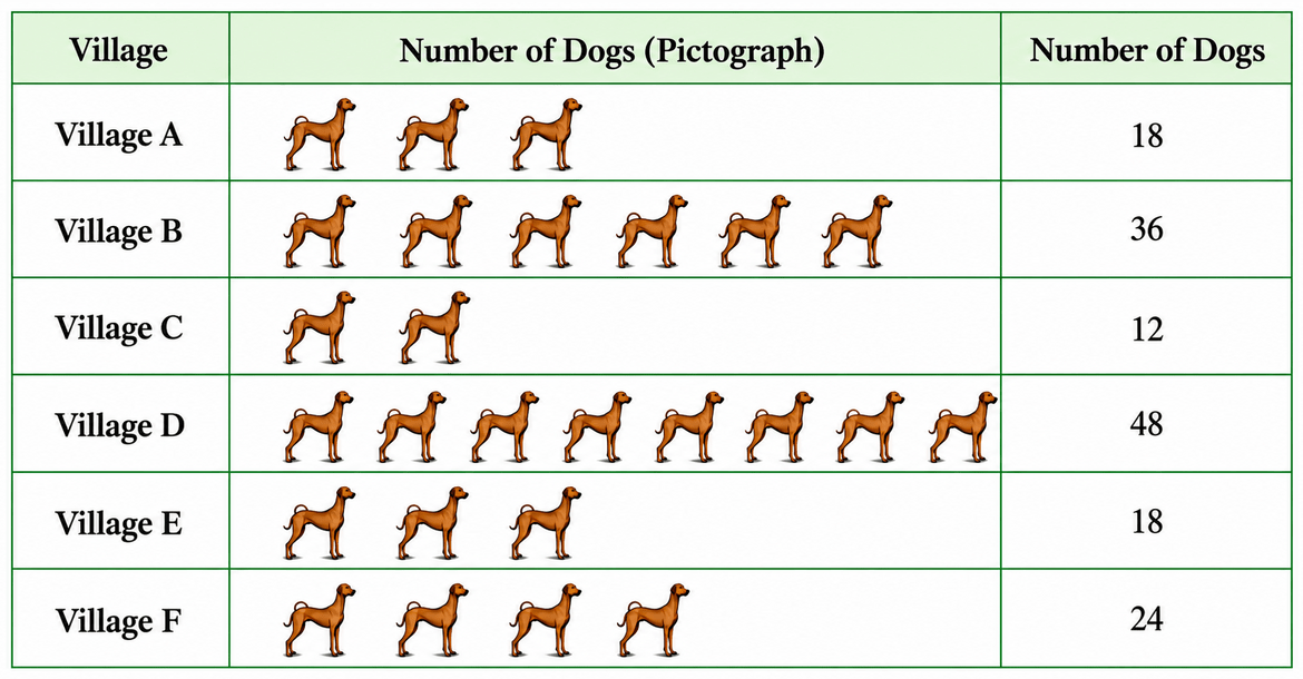
(b) Number of dogs in Village B = 36
Number of symbols = = 6
Hence, 6 symbols will be used to represent the dogs in Village B.
(c) Number of dogs in Village B and Village D together
= 36 + 48
= 84
Number of dogs in the other 4 villages (A, C, E and F)
= 18 + 12 + 18 + 24
= 72
Since 84 > 72,
Hence, Kamini is right — the number of dogs in Villages B and D together (84) is more than the number of dogs in the other four villages (72).
A survey of 120 school students was conducted to find out which activity they preferred to do in their free time:
| Preferred Activity | Number of Students |
|---|---|
| Playing | 45 |
| Reading story books | 30 |
| Watching TV | 20 |
| Listening to music | 10 |
| Painting | 15 |
Draw a bar graph to illustrate the above data taking the scale of 1 unit length = 5 students. Which activity is preferred by most students other than playing?
Answer
Here, the scale is 1 unit length = 5 students.
So, the height of each bar is obtained by dividing the number of students by 5 :
| Preferred Activity | Number of Students | Height of the bar (1 unit length = 5 students) |
|---|---|---|
| Playing | 45 | 45 ÷ 5 = 9 units |
| Reading story books | 30 | 30 ÷ 5 = 6 units |
| Watching TV | 20 | 20 ÷ 5 = 4 units |
| Listening to music | 10 | 10 ÷ 5 = 2 units |
| Painting | 15 | 15 ÷ 5 = 3 units |
| Total | 120 |
Steps of construction :
⇒ Draw a horizontal line and a vertical line meeting at O.
⇒ Along the horizontal line, mark the five activities with equal gaps between them and label this axis ‘Preferred Activity’.
⇒ Along the vertical line, mark 0, 5, 10, 15, …, 45 at equal distances (1 unit length = 5 students) and label this axis ‘Number of Students’.
⇒ Draw bars of equal width and of heights 9, 6, 4, 2 and 3 units for playing, reading story books, watching TV, listening to music and painting respectively, keeping equal gaps between the bars.
The required bar graph is shown below :
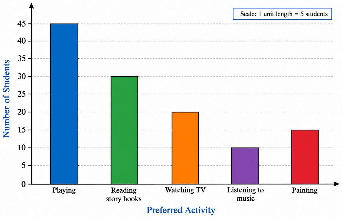
Among the remaining activities, the numbers of students are 30, 20, 10 and 15, of which 30 is the greatest. This is the bar for reading story books, which is the tallest bar after playing.
Hence, other than playing, reading story books is preferred by the most students.
Students and teachers of a primary school decided to plant tree saplings in the school campus and in the surrounding village during the first week of July. Details of the saplings they planted are as follows—
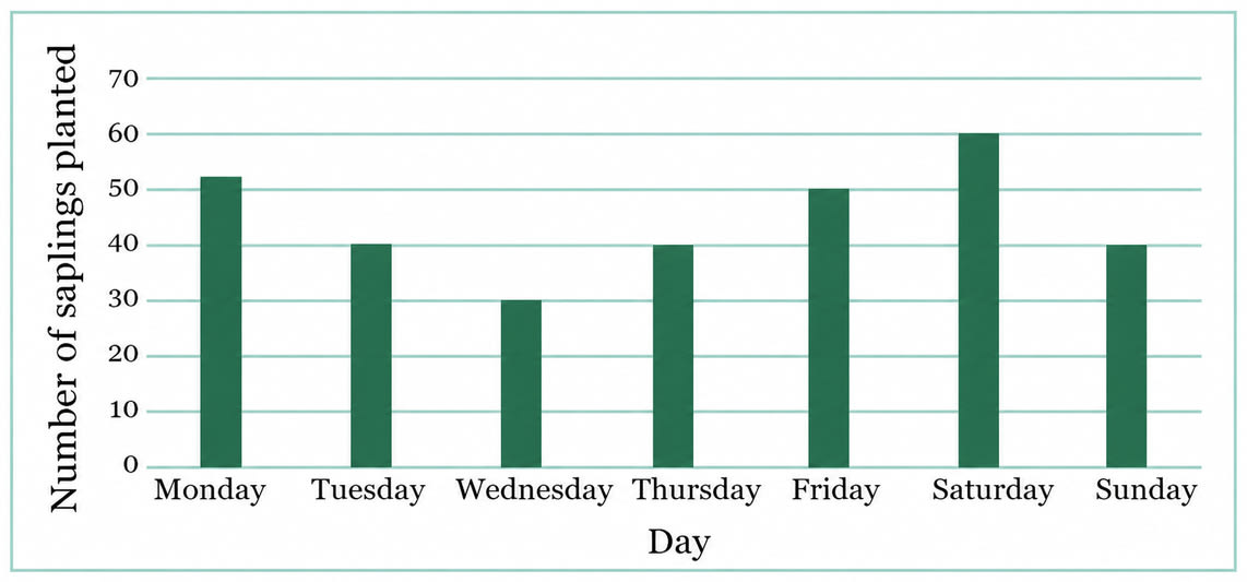
(a) The total number of saplings planted on Wednesday and Thursday is ............... .
(b) The total number of saplings planted during the whole week is ............... .
(c) The greatest number of saplings were planted on ............... and the least number of saplings were planted on ............... . Why do you think that is the case? Why were more saplings planted on certain days of the week and less on others? Can you think of possible explanations or reasons? How could you try and figure out whether your explanations are correct?
Answer
Reading the heights of the bars against the scale (1 unit length = 10 saplings), we get:
| Day | Number of saplings planted |
|---|---|
| Monday | 50 |
| Tuesday | 40 |
| Wednesday | 30 |
| Thursday | 40 |
| Friday | 50 |
| Saturday | 60 |
| Sunday | 40 |
(a) Number of saplings planted on Wednesday = 30
Number of saplings planted on Thursday = 40
Total number of saplings planted on Wednesday and Thursday
= 30 + 40
= 70
Hence, the total number of saplings planted on Wednesday and Thursday is 70.
(b) Total number of saplings planted during the whole week
= 50 + 40 + 30 + 40 + 50 + 60 + 40
= 310
Hence, the total number of saplings planted during the whole week is 310.
(c) The tallest bar is that of Saturday (60 saplings) and the shortest bar is that of Wednesday (30 saplings).
Hence, the greatest number of saplings were planted on Saturday and the least number of saplings were planted on Wednesday.
Some possible reasons for the variation from day to day are:
⇒ Saturday is a half working day (and Sunday a holiday) in many schools, so more students, teachers and villagers were free to join the plantation drive and could give more hours to it.
⇒ On a full working day such as Wednesday, classes, tests or other school work would have left very little time for planting.
⇒ July is a monsoon month, so heavy rain on some days may have stopped the work, while a light drizzle on other days would have made the soil soft and ideal for planting.
⇒ The number of students present, and the number of saplings available on a particular day, may also have been different on different days.
To check whether these explanations are correct, we could :
⇒ Ask the students and teachers who took part what actually happened on each day.
⇒ Look at the school timetable and the attendance register for that week to see how many students were free and present each day.
⇒ Look up the rainfall record of that week for the village, or the newspaper reports of those days.
Hence, the reasons can be checked by collecting more data — attendance records, the school timetable and the weather record of that week.
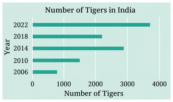
The number of tigers in India went down drastically between 1900 and 1970. Project Tiger was launched in 1973 to track and protect the tigers in India. Starting in 2006, the exact number of tigers in India was tracked. Shagufta and Divya looked up information about the number of tigers in India between 2006 and 2022 in four-year intervals. They prepared a frequency table for this data and a bar graph to present this data, but there are a few mistakes in the graph. Can you find those mistakes and fix them?
| Year | Number of Tigers (approx.) |
|---|---|
| 2006 | 1400 |
| 2010 | 1700 |
| 2014 | 2200 |
| 2018 | 3000 |
| 2022 | 3700 |
Answer
Let us read the length of each bar of the given graph against the scale on the horizontal axis and compare it with the table:
| Year | Number of tigers as per the table | Number of tigers shown by the bar | Correct or not |
|---|---|---|---|
| 2006 | 1400 | about 800 | Incorrect (bar too short) |
| 2010 | 1700 | about 1500 | Incorrect (bar too short) |
| 2014 | 2200 | about 3000 | Incorrect (bar too long) |
| 2018 | 3000 | about 2200 | Incorrect (bar too short) |
| 2022 | 3700 | about 3700 | Correct |
So, the mistakes in the graph are:
⇒ The bar for 2006 has been drawn only up to about 800 instead of 1400.
⇒ The bar for 2010 has been drawn only up to about 1500 instead of 1700.
⇒ The bars for 2014 and 2018 have been interchanged — the bar for 2014 has been drawn up to about 3000 (which is the 2018 figure) and the bar for 2018 up to about 2200 (which is the 2014 figure).
⇒ Because of this interchange, the graph wrongly shows a fall in the number of tigers from 2014 to 2018, whereas the table shows that the number of tigers kept increasing throughout.
Only the bar for 2022 is drawn correctly.
To fix the graph, keeping the same scale and the same uniform width for all the bars, the bars should be redrawn as :
2006 → 1400, 2010 → 1700, 2014 → 2200, 2018 → 3000, 2022 → 3700
so that each bar is longer than the one below it. The corrected bar graph is shown below :
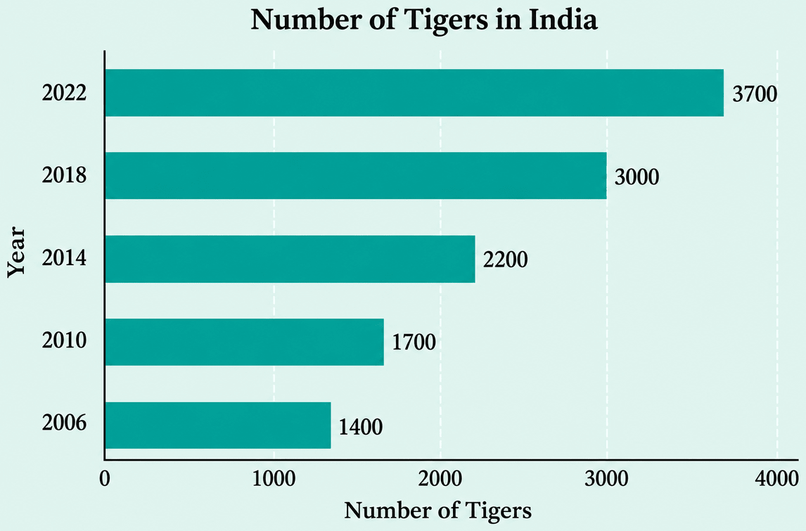
Hence, the bars for 2006, 2010, 2014 and 2018 are wrong and, on being corrected, the graph shows a steady increase in the number of tigers from 1400 in 2006 to 3700 in 2022.
If you wanted to visually represent the data of the heights of the tallest persons in each class in your school, would you use a graph with vertical bars or horizontal bars? Why?
Answer
Here the data being shown is height, and height is a measurement taken upwards from the ground.
So, a bar graph with vertical bars (a column graph) should be used, because then each bar grows upwards from the horizontal axis just as a person stands up from the ground. The taller the person, the taller the bar — so the picture matches the quantity it represents and the heights of the tallest persons of the different classes can be compared at a glance.
Hence, a bar graph with vertical bars should be used, as height is measured upwards from the ground.
If you were making a table of the longest rivers on each continent and their lengths, would you prefer to use a bar graph with vertical bars or with horizontal bars? Why? Try finding out this information, and then make the corresponding table and bar graph! Which continents have the longest rivers?
Answer
Here the data being shown is the length of a river, and a river flows along the ground, that is, its length is measured parallel to the ground.
So, a bar graph with horizontal bars should be used, because then each bar stretches sideways just as a river stretches across the land. The longer the river, the longer the bar.
Hence, a bar graph with horizontal bars should be used, as length along the ground is measured horizontally.
The longest river on each continent, along with its approximate length, is given below :
| Continent | Longest River | Length (approx., in km) |
|---|---|---|
| Africa | Nile | 6650 |
| South America | Amazon | 6400 |
| Asia | Yangtze | 6300 |
| North America | Mississippi–Missouri | 6275 |
| Australia | Murray–Darling | 3670 |
| Europe | Volga | 3530 |
| Antarctica | Onyx | 32 |
Taking a scale of 1 unit length = 500 km and drawing horizontal bars of uniform width for the seven continents, we get the following bar graph :
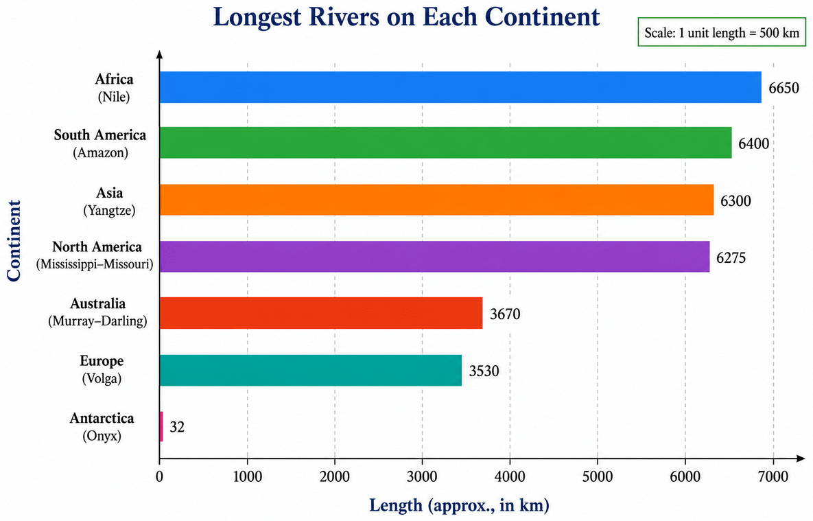
From the table and the graph, the four longest rivers — the Nile, the Amazon, the Yangtze and the Mississippi–Missouri — are all more than 6000 km long, and they are very close to one another in length, while the rivers of Europe, Australia and especially Antarctica are much shorter.
Hence, Africa (the Nile) has the longest river, closely followed by South America (the Amazon), Asia (the Yangtze) and North America (the Mississippi–Missouri).
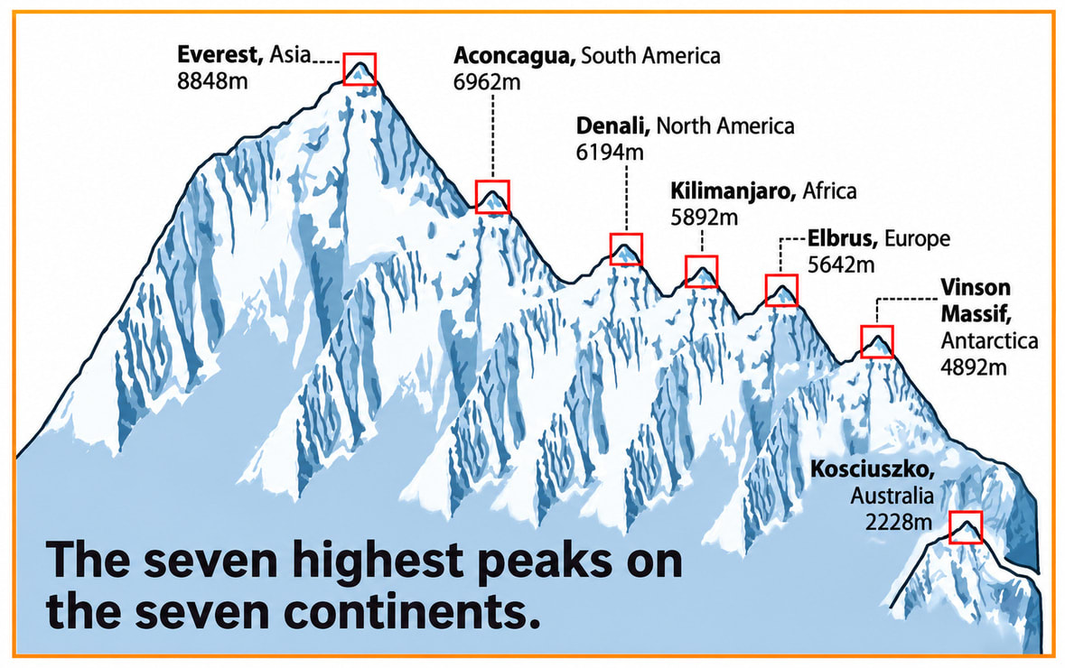
Is the infographic below better than the column graph with rectangular columns of equal width? The mountains look more realistic, but is the picture accurate?
Answer
The infographic is certainly more attractive and more eye-catching than the plain column graph — the peaks really do look like mountains, and one can see at once that Everest is the highest of the seven.
But it is not accurate, for the following reasons:
⇒ The seven peaks are drawn on one continuous mountain range, and each peak rises from a different level of the range. So the bars no longer start from a common zero line, and the heights shown are not measured from the ground upwards.
⇒ There is no vertical axis and no scale on the picture, so the height of a peak in the picture cannot be converted into metres.
⇒ The peaks are not of the same width — the higher peaks are drawn much wider than the lower ones. This suggests, wrongly, that a taller mountain must also be broader.
⇒ Because of this, the picture shows the wrong comparisons. For example, Everest looks about twice as tall as Elbrus, but Everest is 8848 m and Elbrus is 5642 m, and twice of 5642 m is 11284 m, which is far more than 8848 m.
So, in the column graph with rectangular columns of equal width, only the heights differ, and hence only the heights are compared — which is exactly what we want. In the infographic, the extra artwork adds information that is not in the data and misleads the reader.
Hence, the infographic looks better but is not accurate; for comparing heights correctly, the column graph with columns of equal width is the better picture.