
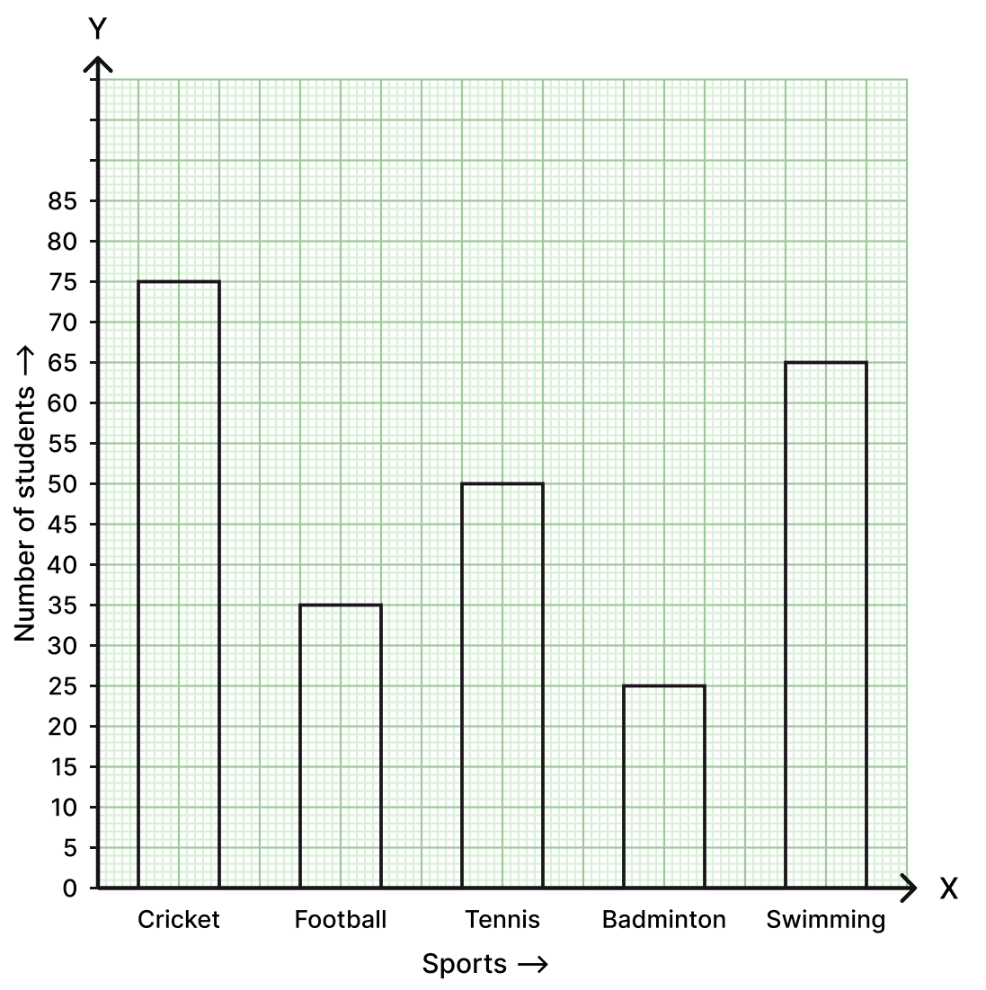
The following table shows the favourite sports of 250 students in a school :
| Sports | Cricket | Football | Tennis | Badminton | Swimming |
|---|---|---|---|---|---|
| Number of students | 75 | 35 | 50 | 25 | 65 |
Represent the above data by a column graph.
Answer
To represent the sports preferences of the student body, we take the names of the sports along the x-axis and the number of students along the y-axis.
Using a scale of 1 cm = 5 students, we may draw the column graph for the given data as shown below.
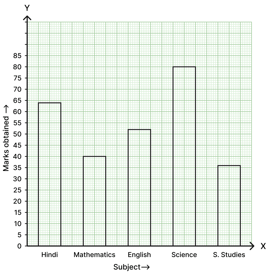
The marks obtained by a student in his annual examination in various subjects are given below :
| Subject | Hindi | Mathematics | English | Science | S.Studies |
|---|---|---|---|---|---|
| Marks obtained | 64 | 40 | 52 | 80 | 36 |
Represent the above data by a bar graph.
Answer
We represent the subjects on the x-axis and the marks obtained on the y-axis.
Taking a scale of 1 cm = 5 marks, the bar graph illustrating the student's performance in various subjects is drawn as follows.
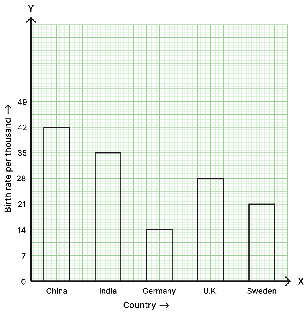
The birth-rate per thousand of five countries over a period of time is shown below :
| Country | China | India | Germany | U.K. | Sweden |
|---|---|---|---|---|---|
| Birth-rate per thousand | 42 | 35 | 14 | 28 | 21 |
Represent the above data by a bar graph.
Answer
The countries are represented along the x-axis and the birth-rate per thousand is taken along the y-axis.
Following the given hint to take 2 cm = 7 infants on the y-axis, we draw the bar graph for the data as shown below.
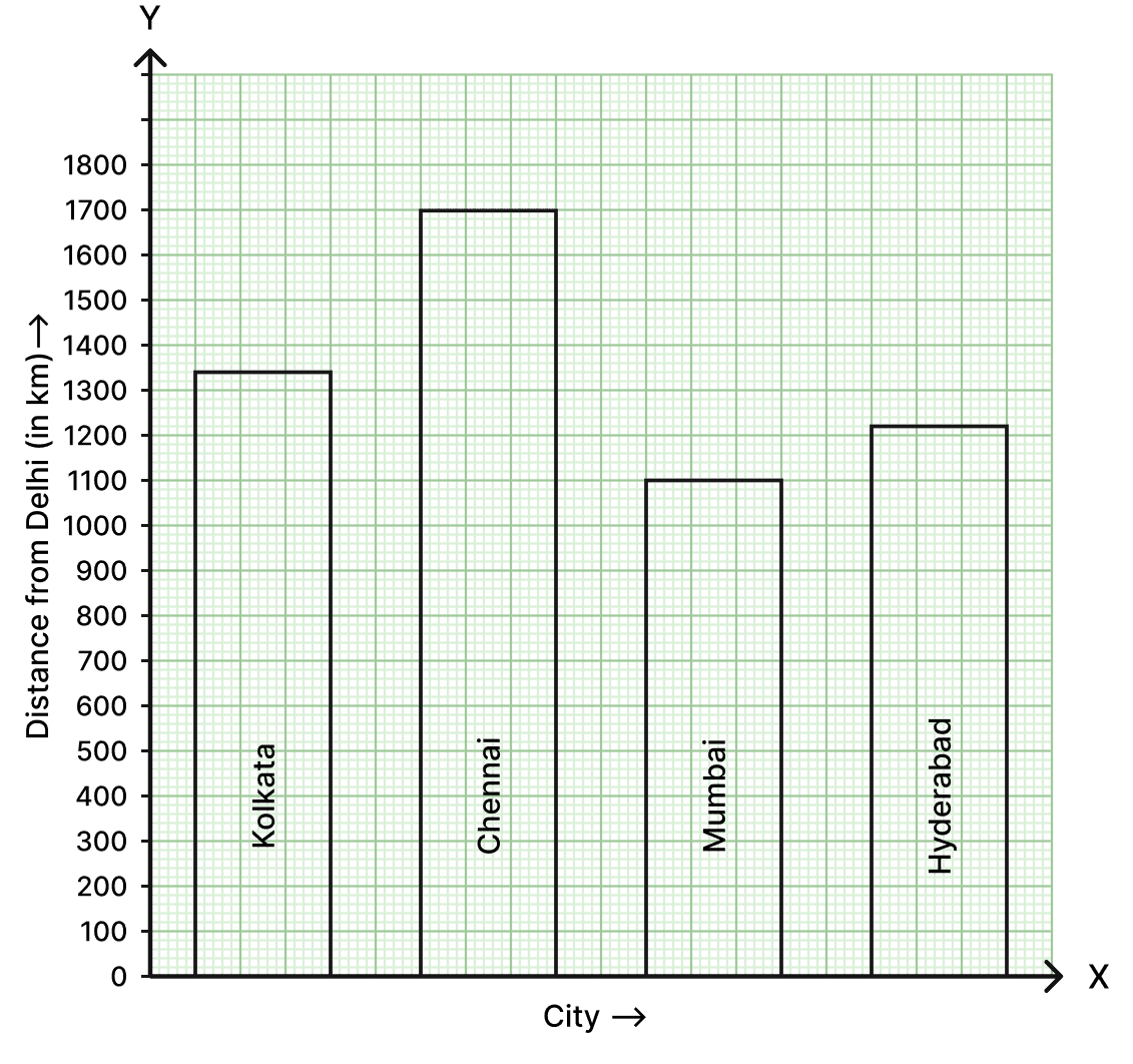
The air distances of four cities from Delhi (in km) are given below :
| City | Kolkata | Chennai | Mumbai | Hyderabad |
|---|---|---|---|---|
| Distance from Delhi (in km) | 1340 | 1700 | 1100 | 1220 |
Draw a bar graph to represent the above data.
Answer
Cities are represented along the x-axis and their respective distances from Delhi along the y-axis.
Taking a scale of 1 cm = 100 km. The bar graph representing the air distances (in km) is provided below.
Read the given bar graph and answer the questions that follow :
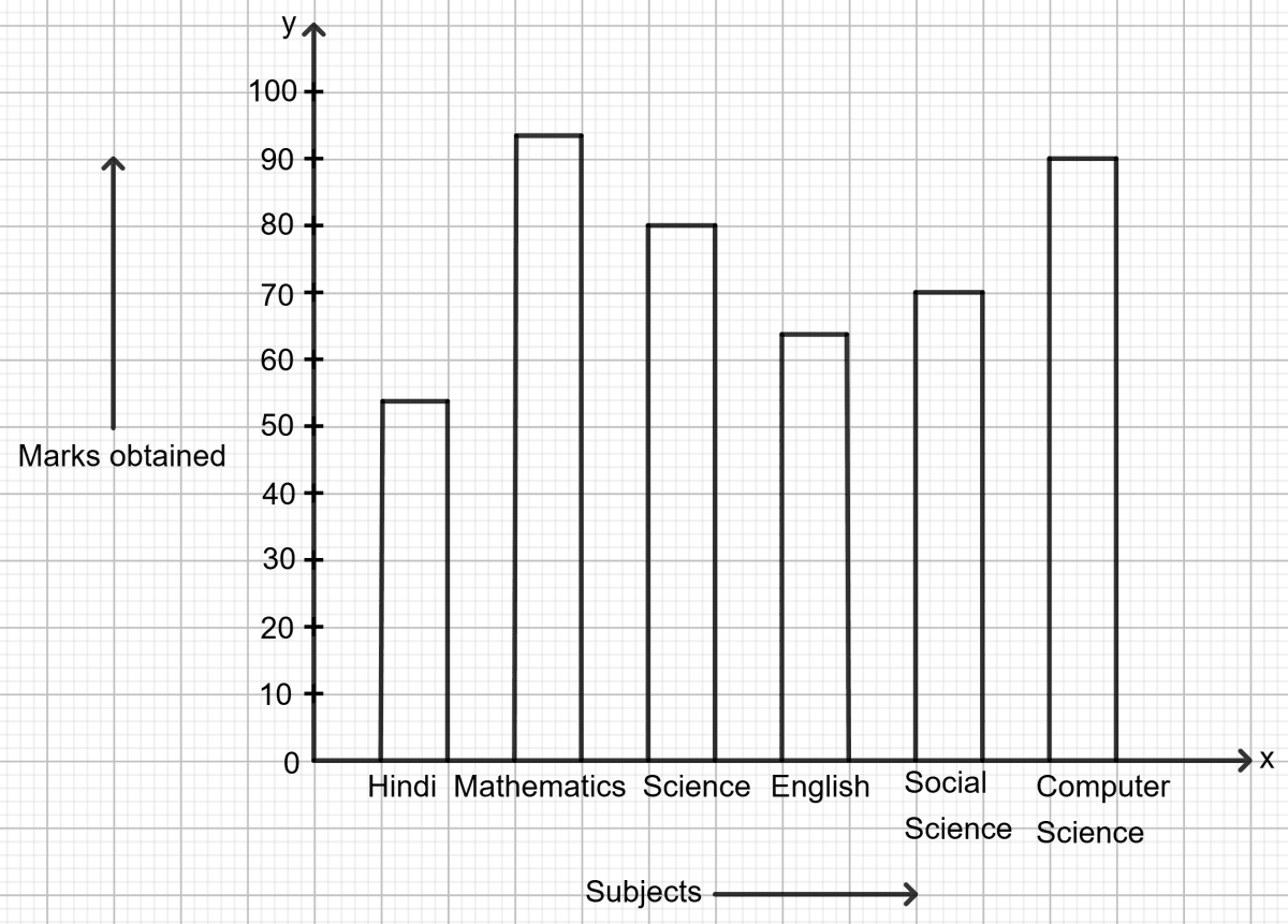
(i) What information is represented by the bar graph?
(ii) How many marks were obtained in English?
(iii) In which subject least marks were obtained?
(iv) What was the total marks obtained in all the subjects together?
Answer
From the given bar graph, the marks obtained in different subjects are :
Hindi = 55, Mathematics = 95, Science = 80, English = 65, Social Science = 70, Computer Science = 90.
(i) What information is represented by the bar graph?
The bar graph shows the marks obtained by a student in various subjects in an examination.
(ii) How many marks were obtained in English?
The marks obtained in English are 65.
(iii) In which subject least marks were obtained?
Least marks were obtained in Hindi.
(iv) What was the total marks obtained in all the subjects together?
Total marks obtained in all subjects together
= 55 + 95 + 80 + 65 + 70 + 90
= 455
Hence, the total marks obtained in all subjects together is 455.
Read the bar graph given below :
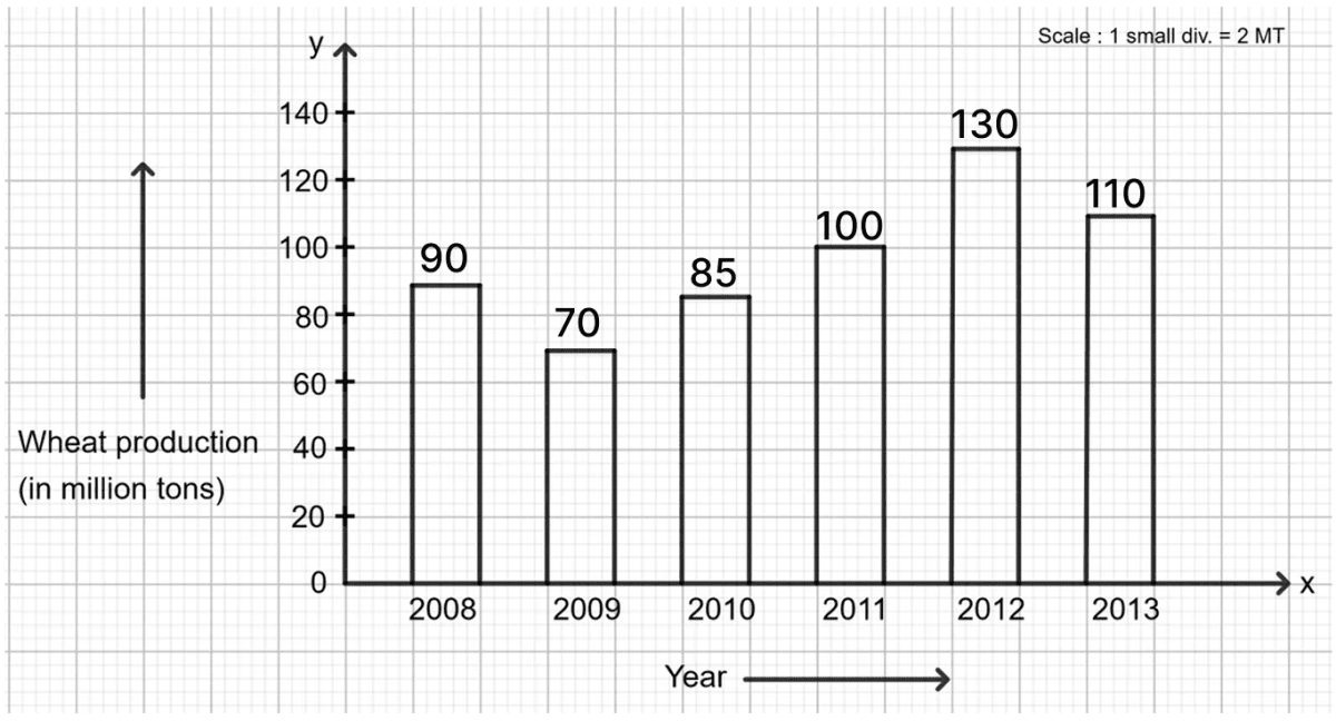
Answer the following questions :
(i) What information is given by the bar graph?
(ii) What was the wheat production in 2010?
(iii) In which year the production was minimum?
(iv) In which year there was maximum increase in production of wheat?
(v) Find the percentage increase in wheat production in the year 2012.
Answer
From the given bar graph, the wheat production (in million tons) in different years are :
2008 = 90, 2009 = 70, 2010 = 85, 2011 = 100, 2012 = 130, 2013 = 110.
(i) What information is given by the bar graph?
The bar graph represents quantity of wheat produced (in million tons, i.e., in MT) by a state in various years from 2008 to 2013.
(ii) What was the wheat production in 2010?
The wheat production in 2010 was 85 MT.
(iii) In which year the production was minimum?
The production was minimum in the year 2009.
(iv) In which year there was maximum increase in production of wheat?
Increase in production :
From 2008 to 2009 = 70 - 90 = -20 million tons (a decrease)
From 2009 to 2010 = 85 - 70 = 15 million tons
From 2010 to 2011 = 100 - 85 = 15 million tons
From 2011 to 2012 = 130 - 100 = 30 million tons
Clearly, the maximum increase in production was in the year 2012.
The maximum increase in production of wheat was in the year 2012.
(v) Find the percentage increase in wheat production in the year 2012.
Percentage increase in wheat production in 2012
= 30%
Hence, the percentage increase in wheat production in the year 2012 is 30%.