The area under wheat cultivation last year in the following states, correct to the nearest lacs hectares was :
| State | Cultivated area |
|---|---|
| Punjab | 220 |
| Haryana | 120 |
| U.P. | 100 |
| M.P. | 40 |
| Maharashtra | 80 |
| Rajasthan | 30 |
Represent the above information by a bar graph.
Answer
Steps of construction :
Take states along x-axis.
Take 1 cm along y-axis = 20 lac hectares.
Construct rectangles corresponding to the above distribution table.
The required bar graph is shown in the adjoining figure.

The number of books sold by a shopkeeper in a certain week was as follows :
| Day | No. of books |
|---|---|
| Monday | 420 |
| Tuesday | 180 |
| Wednesday | 230 |
| Thursday | 340 |
| Friday | 160 |
| Saturday | 120 |
Draw a bar graph for the above data.
Answer
Steps of construction :
Take days along x-axis.
Take 1 cm along y-axis = 50 books.
Construct rectangles corresponding to the above distribution table.
The required bar graph is shown in the adjoining figure.

Given below is the data of percentage of passes of a certain school in the ICSE for consecutive years :
| Year | % of passes |
|---|---|
| 2000 | 92 |
| 2001 | 80 |
| 2002 | 70 |
| 2003 | 86 |
| 2004 | 54 |
| 2005 | 78 |
| 2006 | 94 |
Draw a bar graph to represent the above data.
Answer
Steps of construction :
Take year along x-axis.
Take 1 cm along y-axis = 10 %.
Construct rectangles corresponding to the above distribution table.
The required bar graph is shown in the adjoining figure.

Birth rate per thousand of different countries over a period is :
| Country | Birth rate |
|---|---|
| India | 36 |
| Pakistan | 45 |
| China | 12 |
| U.S.A. | 18 |
| France | 20 |
Draw a horizontal bar graph to represent the above data.
Answer
Steps of construction :
Take country along y-axis.
Take birth rate along x-axis.
Construct rectangles corresponding to the above distribution table.
The required bar graph is shown in the adjoining figure.

Given below is the data of number of students (boys and girls) in class IX of a certain school :
| Class | Boys | Girls |
|---|---|---|
| IX A | 28 | 18 |
| IX B | 22 | 34 |
| IX C | 40 | 12 |
| IX D | 15 | 25 |
Draw a bar graph to represent the above data.
Answer
Steps of construction :
Take class along x-axis.
Take 1 cm along y-axis = 5 students.
Construct rectangles corresponding to the above distribution table.
The required bar graph is shown in the adjoining figure.

Draw a histogram to represent the following data :
| Marks obtained | No. of students |
|---|---|
| 0 - 10 | 4 |
| 10 - 20 | 10 |
| 20 - 30 | 6 |
| 30 - 40 | 8 |
| 40 - 50 | 5 |
| 50 - 60 | 9 |
Answer
Steps of construction of histogram :
Take 2 cm along x-axis = 10 marks.
Take 1 cm along y-axis = 1 student.
Construct rectangles corresponding to the above continuous frequency distribution table.
The required histogram is shown in the adjoining figure.

Draw a histogram to represent the following frequency distribution of monthly wages of 255 workers of a factory.
| Monthly wages (in rupees) | No. of workers |
|---|---|
| 850 - 950 | 35 |
| 950 - 1050 | 45 |
| 1050 - 1150 | 75 |
| 1150 - 1250 | 60 |
| 1250 - 1350 | 40 |
Answer
Steps of construction of histogram :
Since the scale on x-axis starts at 850, a kink is shown near the origin on x-axis to indicate that the graph is drawn to scale beginning at 850.
Take 2 cm along x-axis = 100 rupees.
Take 1 cm along y-axis = 10 workers.
Construct rectangles corresponding to the above continuous frequency distribution table.
The required histogram is shown in the adjoining figure.

Draw a histogram for the following data :
| Class marks | Frequency |
|---|---|
| 12.5 | 7 |
| 17.5 | 12 |
| 22.5 | 20 |
| 27.5 | 28 |
| 32.5 | 8 |
| 37.5 | 11 |
Answer
We know that class mark is the mid-point of class. So, frequency distribution table for above data is :
| Class marks | Class | Frequency |
|---|---|---|
| 12.5 | 10 - 15 | 7 |
| 17.5 | 15 - 20 | 12 |
| 22.5 | 20 - 25 | 20 |
| 27.5 | 25 - 30 | 28 |
| 32.5 | 30 - 35 | 8 |
| 37.5 | 35 - 40 | 11 |
Steps of construction of histogram :
Since the scale on x-axis starts at 10, a kink is shown near the origin on x-axis to indicate that the graph is drawn to scale beginning at 10.
Take 2 cm along x-axis = 5 units.
Take 1 cm along y-axis = 5 units.
Construct rectangles corresponding to the above continuous frequency distribution table.
The required histogram is shown in the adjoining figure.

Draw a histogram for the following frequency distribution :
| Age (in years) | No. of children |
|---|---|
| below 2 | 12 |
| below 4 | 15 |
| below 6 | 36 |
| below 8 | 45 |
| below 10 | 72 |
| below 12 | 90 |
Answer
Frequency distribution table for above data is :
| Age (in years) | No. of children (Cumulative frequency) | Frequency |
|---|---|---|
| 0 - 2 | 12 | 12 |
| 2 - 4 | 15 | 3 (15 - 12) |
| 4 - 6 | 36 | 21 (36 - 15) |
| 6 - 8 | 45 | 9 (45 - 36) |
| 8 - 10 | 72 | 27 (72 - 45) |
| 10 - 12 | 90 | 18 (90 - 72) |
Steps of construction of histogram :
Take 2 cm along x-axis = 2 years.
Take 1 cm along y-axis = 3 children.
Construct rectangles corresponding to the above continuous frequency distribution table.
The required histogram is shown in the adjoining figure.

Draw a histogram for the following data :
| Classes | Frequency |
|---|---|
| 59 - 65 | 10 |
| 66 - 72 | 5 |
| 73 - 79 | 25 |
| 80 - 86 | 15 |
| 87 - 93 | 30 |
| 94 - 100 | 10 |
Answer
The following frequency distribution is discontinuous, to convert it into continuous frequency distribution,
Adjustment factor = (Lower limit of one class - Upper limit of previous class) / 2
=
= 0.5
Subtract the adjustment factor (0.5) from all the lower limits and add the adjustment factor (0.5) to all the upper limits.
Continuous frequency distribution for given data is :
| Classes before adjustment | Classes after adjustment | Frequency |
|---|---|---|
| 59 - 65 | 58.5 - 65.5 | 10 |
| 66 - 72 | 65.5 - 72.5 | 5 |
| 73 - 79 | 72.5 - 79.5 | 25 |
| 80 - 86 | 79.5 - 86.5 | 15 |
| 87 - 93 | 86.5 - 93.5 | 30 |
| 94 - 100 | 93.5 - 100.5 | 10 |
Steps of construction of histogram :
Since, the scale on x-axis starts at 58.5, a break (kink) is shown near the origin on x-axis to indicate that the graph is drawn to scale beginning at 58.5
Take 2 cm along x-axis = 7 units.
Take 1 cm along y-axis = 5 units.
Construct rectangles corresponding to the above continuous frequency distribution table.
The required histogram is shown in the adjoining figure.

Draw a frequency polygon for the following data :
| Class intervals | Frequency |
|---|---|
| 40 - 50 | 15 |
| 50 - 60 | 28 |
| 60 - 70 | 45 |
| 70 - 80 | 32 |
| 80 - 90 | 41 |
| 90 - 100 | 18 |
Answer
Frequency distribution table :
| Class intervals | Class marks | Frequency |
|---|---|---|
| 40 - 50 | 45 | 15 |
| 50 - 60 | 55 | 28 |
| 60 - 70 | 65 | 45 |
| 70 - 80 | 75 | 32 |
| 80 - 90 | 85 | 41 |
| 90 - 100 | 95 | 18 |
Steps to draw frequency polygon :
Since, the scale on x-axis starts at 30, a kink is shown near the origin on x-axis to indicate that the graph is drawn to scale beginning at 30.
Take 1 cm along x-axis = 10 units.
Take 1 cm along y-axis = 5 units.
Find the mid-points of class-intervals.
Find points corresponding to given frequencies of classes and the mid-points of class-intervals, and plot them.
Join consecutive points by line segments.
Join first end point with mid-point of class 30 - 40 with zero frequency and join the other end with mid-point of class 100 - 110 with zero frequency.
The required frequency polygon is shown below:

In a class of 60 students, the marks obtained in a monthly test were as under :
| Marks | Students |
|---|---|
| 10 - 20 | 10 |
| 20 - 30 | 25 |
| 30 - 40 | 12 |
| 40 - 50 | 08 |
| 50 - 60 | 05 |
Answer
Frequency distribution table :
| Marks | Class marks | Students |
|---|---|---|
| 10 - 20 | 15 | 10 |
| 20 - 30 | 25 | 25 |
| 30 - 40 | 35 | 12 |
| 40 - 50 | 45 | 08 |
| 50 - 60 | 55 | 05 |
Steps to draw frequency polygon :
Take 2 cm along x-axis = 10 marks.
Take 1 cm along y-axis = 5 students.
Find the mid-points of class-intervals.
Find points corresponding to given frequencies of classes and the mid-points of class-intervals, and plot them.
Join consecutive points by line segments.
Join first end point with mid-point of class 0 - 10 with zero frequency and join the other end with mid-point of class 60 - 70 with zero frequency.
The required frequency polygon is shown below:

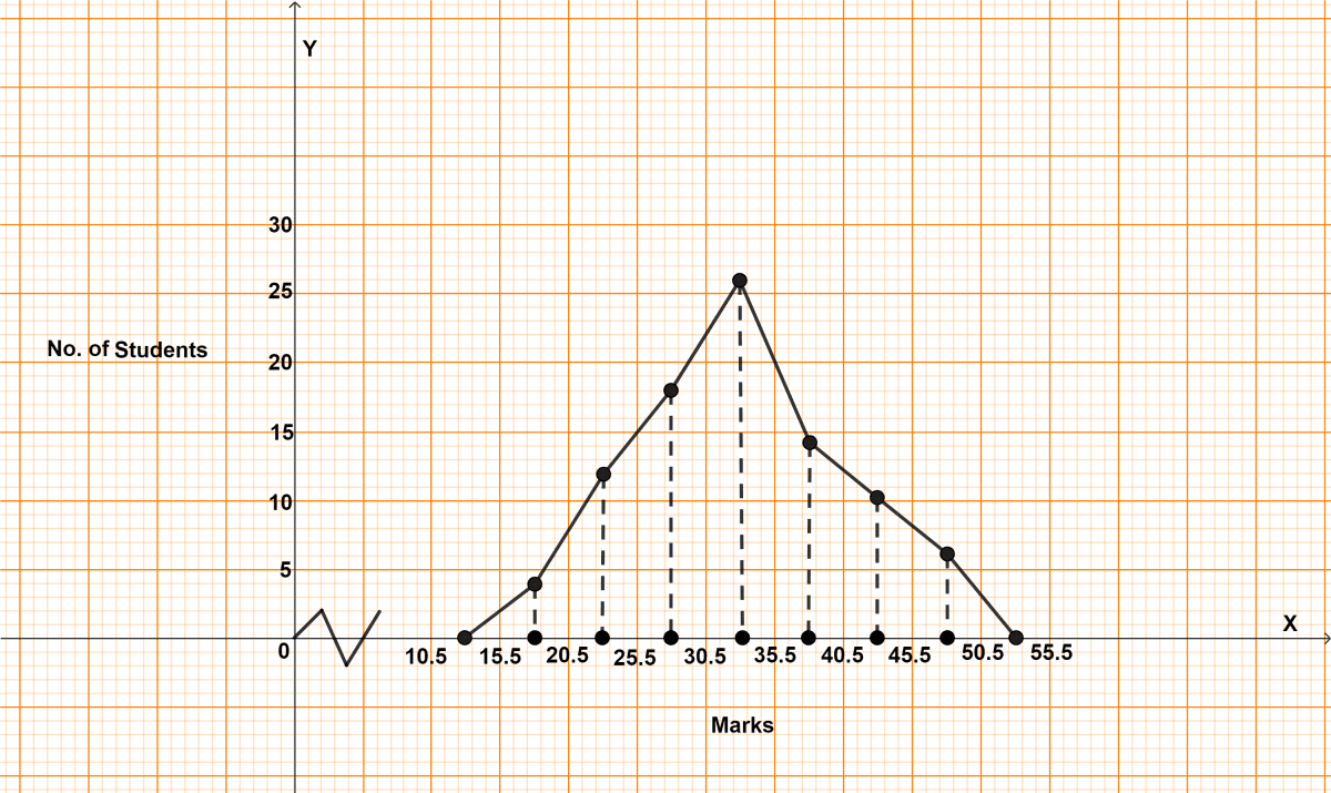
In a class of 90 students, the marks obtained in a weekly test were as under :
| Marks | No. of students |
|---|---|
| 16 - 20 | 4 |
| 21 - 25 | 12 |
| 26 - 30 | 18 |
| 31 - 35 | 26 |
| 36 - 40 | 14 |
| 41 - 45 | 10 |
| 46 - 50 | 6 |
Draw a frequency polygon for the above data.
Answer
The following frequency distribution is discontinuous, to convert it into continuous frequency distribution,
Adjustment factor = (Lower limit of one class - Upper limit of previous class) / 2
=
= 0.5
Subtract the adjustment factor (0.5) from all the lower limits and add the adjustment factor (0.5) to all the upper limits.
Continuous frequency distribution for given data is :
| Classes before adjustment | Classes after adjustment | Class mark | Frequency |
|---|---|---|---|
| 16 - 20 | 15.5 - 20.5 | 18 | 4 |
| 21 - 25 | 20.5 - 25.5 | 23 | 12 |
| 26 - 30 | 25.5 - 30.5 | 28 | 18 |
| 31 - 35 | 30.5 - 35.5 | 33 | 26 |
| 36 - 40 | 35.5 - 40.5 | 38 | 14 |
| 41 - 45 | 40.5 - 45.5 | 43 | 10 |
| 46 - 50 | 45.5 - 50.5 | 48 | 6 |
Steps to draw frequency polygon :
Since, the scale on x-axis starts at 10.5, a kink is shown near the origin on x-axis to indicate that the graph is drawn to scale beginning at 10.5.
Take 1 cm along x-axis = 5 marks.
Take 1 cm along y-axis = 5 students.
Find the mid-points of class-intervals.
Find points corresponding to given frequencies of classes and the mid-points of class-intervals, and plot them.
Join consecutive points by line segments.
Join first end point with mid-point of class 10.5 - 15.5 with zero frequency and join the other end with mid-point of class 50.5 - 55.5 with zero frequency.
The required frequency polygon is shown alongside.
In a city, the weekly observations made in a study on the cost of living index are given in the following table :
| Cost of living index | Number of weeks |
|---|---|
| 140 - 150 | 5 |
| 150 - 160 | 10 |
| 160 - 170 | 20 |
| 170 - 180 | 9 |
| 180 - 190 | 6 |
| 190 - 200 | 2 |
Draw a frequency polygon for the data given above.
Answer
Frequency distribution table :
| Cost of living index | Class marks | Number of weeks |
|---|---|---|
| 140 - 150 | 145 | 5 |
| 150 - 160 | 155 | 10 |
| 160 - 170 | 165 | 20 |
| 170 - 180 | 175 | 9 |
| 180 - 190 | 185 | 6 |
| 190 - 200 | 195 | 2 |
Steps to draw frequency polygon :
Since, the scale on x-axis starts at 130, a kink is shown near the origin on x-axis to indicate that the graph is drawn to scale beginning at 130.
Take 2 cm along x-axis = 10 units (cost of living index).
Take 2 cm along y-axis = 5 weeks.
Find the mid-points of class-intervals.
Find points corresponding to given frequencies of classes and the mid-points of class-intervals, and plot them.
Join consecutive points by line segments.
Join first end point with mid-point of class 130 - 140 with zero frequency and join the other end with mid-point of class 200 - 210 with zero frequency.
The required frequency polygon is shown alongside.

Construct a combined histogram and frequency polygon for the following data :
| Weekly earnings (in rupees) | No. of workers |
|---|---|
| 150 - 165 | 8 |
| 165 - 180 | 14 |
| 180 - 195 | 22 |
| 195 - 210 | 12 |
| 210 - 225 | 15 |
| 225 - 240 | 6 |
Answer
Frequency distribution table :
| Weekly earnings | Class marks | No. of workers |
|---|---|---|
| 150 - 165 | 157.5 | 8 |
| 165 - 180 | 172.5 | 14 |
| 180 - 195 | 187.5 | 22 |
| 195 - 210 | 202.5 | 12 |
| 210 - 225 | 217.5 | 15 |
| 225 - 240 | 232.5 | 6 |
Steps of construction of histogram :
Since, the scale on x-axis starts at 135, a break (kink) is shown near the origin on x-axis to indicate that the graph is drawn to scale beginning at 135.
Take 2 cm along x-axis = 15 rupees.
Take 2 cm along y-axis = 5 workers.
Construct rectangles corresponding to the above continuous frequency distribution table.
The required histogram is shown in the adjoining figure.
Steps of construction of frequency polygon :
Mark the mid-points of upper bases of rectangles of the histogram.
Join the consecutive mid-points by line segments.
Join the first end point with the mid-point of class 135 - 150 with zero frequency, and join the other end point with the mid-point of class 240 - 255 with zero frequency.
The required frequency polygon is shown by thick line segments in the diagram.

In a study of diabetic patients, the following data was obtained :
| Age (in years) | No. of patients |
|---|---|
| 10 - 20 | 3 |
| 20 - 30 | 8 |
| 30 - 40 | 30 |
| 40 - 50 | 36 |
| 50 - 60 | 27 |
| 60 - 70 | 15 |
| 70 - 80 | 6 |
Represent the above data by a histogram and a frequency polygon.
Answer
Frequency distribution table :
| Age (in years) | Class marks | No. of patients |
|---|---|---|
| 10 - 20 | 15 | 3 |
| 20 - 30 | 25 | 8 |
| 30 - 40 | 35 | 30 |
| 40 - 50 | 45 | 36 |
| 50 - 60 | 55 | 27 |
| 60 - 70 | 65 | 15 |
| 70 - 80 | 75 | 6 |
Steps of construction of histogram :
Take 1 cm along x-axis = 10 years.
Take 1 cm along y-axis = 6 patients.
Construct rectangles corresponding to the above continuous frequency distribution table.
The required histogram is shown in the adjoining figure.
Steps of construction of frequency polygon :
Mark the mid-points of upper bases of rectangles of the histogram.
Join the consecutive mid-points by line segments.
Join the first end point with the mid-point of class 0 - 10 with zero frequency, and join the other end point with the mid-point of class 80 - 90 with zero frequency.
The required frequency polygon is shown by thick line segments in the diagram.

The water bills (in rupees) of 32 houses in a locality are given below:
30, 48, 52, 78, 103, 85, 37, 94, 72, 73, 66, 52, 92, 65, 78, 81, 64, 60, 75, 78, 108, 63, 71, 54, 59, 75, 100, 103, 35, 89, 95, 73.
Taking class intervals 30 - 40, 40 - 50, 50 - 60, ......, form frequency distribution table.
Construct a combined histogram and frequency polygon.
Answer
First represent the given data in the form of a frequency distribution table.
Here, class intervals represent water bills class and frequency represents no. of houses.
| Class Intervals | Class marks | Tally Marks | Frequency |
|---|---|---|---|
| 30 - 40 | 35 | III | 3 |
| 40 - 50 | 45 | I | 1 |
| 50 - 60 | 55 | IIII | 4 |
| 60 - 70 | 65 | 5 | |
| 70 - 80 | 75 | 9 | |
| 80 - 90 | 85 | III | 3 |
| 90 - 100 | 95 | III | 3 |
| 100 - 110 | 105 | IIII | 4 |
Steps of construction of histogram :
Take 1 cm along x-axis = 10 units.
Take 1 cm along y-axis = 1 unit.
Construct rectangles corresponding to the above continuous frequency distribution table.
The required histogram is shown in the adjoining figure.
Steps of construction of frequency polygon :
Mark the mid-points of upper bases of rectangles of the histogram.
Join the consecutive mid-points by line segments.
Join the first end point with the mid-point of class 20 - 30 with zero frequency, and join the other end point with the mid-point of class 110 - 120 with zero frequency.
The required frequency polygon is shown by thick line segments in the diagram.

The number of matchsticks in 40 boxes on counting was found as given below:
44, 41, 42, 43, 47, 50, 51, 49, 43, 42, 40, 42, 44, 45, 49, 42, 46, 49, 45, 49, 45, 47, 48, 43, 43, 44, 48, 43, 46, 50, 43, 52, 46, 49, 52, 51, 47, 43, 43, 45.
Taking classes 40 - 42, 42 - 44 ......, construct the frequency distribution table for the above data. Also draw a combined histogram and frequency polygon to represent the distribution.
Answer
First represent the given data in a frequency distribution table as shown below:
| Class Intervals | Class marks | Tally Marks | Frequency |
|---|---|---|---|
| 40 - 42 | 41 | II | 2 |
| 42 - 44 | 43 | 12 | |
| 44 - 46 | 45 | 7 | |
| 46 - 48 | 47 | 6 | |
| 48 - 50 | 49 | 7 | |
| 50 - 52 | 51 | IIII | 4 |
| 52 - 54 | 53 | II | 2 |
Steps of construction of histogram :
Since, the scale on x-axis starts at 38, a kink is shown near the origin on x-axis to indicate that the graph is drawn to scale beginning at 38.
Take 1 cm along x-axis = 2 units.
Take 1 cm along y-axis = 2 units.
Construct rectangles corresponding to the above continuous frequency distribution table.
The required histogram is shown in the adjoining figure.
Steps of construction of frequency polygon :
Mark the mid-points of upper bases of rectangles of the histogram.
Join the consecutive mid-points by line segments.
Join the first end point with the mid-point of class 38 - 40 with zero frequency, and join the other end point with the mid-point of class 54 - 56 with zero frequency.
The required frequency polygon is shown by thick line segments in the diagram.

The histogram showing the weekly wages (in rupees) of workers in a factory is given alongside.

Answer the following about the frequency distribution:
(i) What is the frequency of the class 400 - 425?
(ii) What is the class having minimum frequency?
(iii) What is the cumulative frequency of the class 425 – 450?
(iv) Construct a frequency and cumulative frequency table for the given distribution.
Answer
(i) From graph,
The frequency of class 400 - 425 is 18.
(ii) From graph,
Minimum frequency of a class = 4.
Hence, the class having minimum frequency is 475 - 500.
(iii) Cumulative frequency of class 425 - 450 = Sum of frequency of class 425 - 450 and previous classes
= 10 + 18 + 6 = 34.
Hence, cumulative frequency of class 425 - 450 = 34.
(iv) The cumulative frequency distribution table for given distribution is shown below :
| Classes | Frequency | Cumulative frequency |
|---|---|---|
| 375 - 400 | 6 | 6 |
| 400 - 425 | 18 | 24 (6 + 18) |
| 425 - 450 | 10 | 34 (24 + 10) |
| 450 - 475 | 20 | 54 (34 + 20) |
| 475 - 500 | 4 | 58 (54 + 4) |
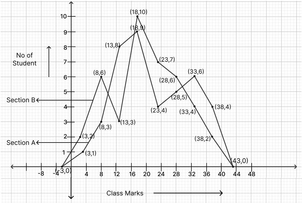
Marks scored by students of class 10A and 10B in a particular class test are as follows:
| Marks | No. of students of 10A | No. of students of 10B |
|---|---|---|
| 1 - 5 | 1 | 2 |
| 6 - 10 | 3 | 6 |
| 11 - 15 | 8 | 3 |
| 16 - 20 | 9 | 10 |
| 21 - 25 | 4 | 7 |
| 26 - 30 | 5 | 6 |
| 31 - 35 | 6 | 4 |
| 36 - 40 | 4 | 2 |
Draw their frequency polygons on the same graph.
Answer
The following frequency distribution is discontinuous, to convert it into continuous frequency distribution,
Adjustment factor =
=
Subtract the adjustment factor (0.5) from all the lower limits and add the adjustment factor (0.5) to all the upper limits.
Continuous frequency distribution for given data is :
| Classes before adjustment | Classes after adjustment | Class marks | No. of students of 10A | No. of students of 10B |
|---|---|---|---|---|
| 1 - 5 | 0.5 - 5.5 | 3 | 1 | 2 |
| 6 - 10 | 5.5 - 10.5 | 8 | 3 | 6 |
| 11 - 15 | 10.5 - 15.5 | 13 | 8 | 3 |
| 16 - 20 | 15.5 - 20.5 | 18 | 9 | 10 |
| 21 - 25 | 20.5 - 25.5 | 23 | 4 | 7 |
| 26 - 30 | 25.5 - 30.5 | 28 | 5 | 6 |
| 31 - 35 | 30.5 - 35.5 | 33 | 6 | 4 |
| 36 - 40 | 35.5 - 40.5 | 38 | 4 | 2 |
Steps to draw frequency polygon :
Take 1 cm along x-axis = 4 units.
Take 1 cm along y-axis = 1 units.
Find the mid-points of class-intervals.
Find points corresponding to given frequencies of classes and the mid-points of class-intervals, and plot them.
Join consecutive points by line segments.
Join first end point with mid-point of class -5.5 - 0.5 with zero frequency and join the other end with mid-point of class 40.5 - 45.5 with zero frequency.
The required frequency polygon is shown alongside.