
Mathematics
Draw a histogram to represent the following data :
| Class mark | Frequency |
|---|---|
| 150 | 15 |
| 160 | 28 |
| 170 | 12 |
| 180 | 36 |
| 190 | 8 |
| 200 | 18 |
Draw a histogram to represent the above data.
Statistics
2 Likes
Answer
Since, the difference between the values of any two consecutive class marks is 10 (160 - 150)
∴ subtract = 5, from each class mark to get the lower limit of the corresponding class interval and add 5 to each class mark to get the upper limit.
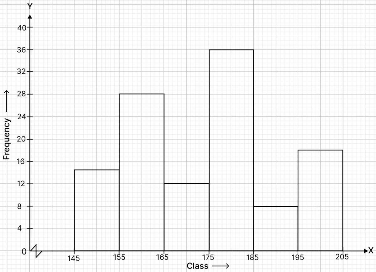
Frequency distribution table :
| Class mark | Class | Frequency |
|---|---|---|
| 150 | 145 - 155 | 15 |
| 160 | 155 - 165 | 28 |
| 170 | 165 - 175 | 12 |
| 180 | 175 - 185 | 36 |
| 190 | 185 - 195 | 8 |
| 200 | 195 - 205 | 18 |
Steps of construction of histogram :
Since, the scale on x-axis starts at 145, a break (kink) is shown near the origin on x-axis to indicate that the graph is drawn to scale beginning at 145.
Take 2 cm along x-axis = 10 units.
Take 1 cm along y-axis = 4 units.
Construct rectangles corresponding to the above continuous frequency distribution table.
The required histogram is shown in the below figure :
Answered By
2 Likes
Related Questions
Construct a histogram for the following frequency distribution :
Class interval Frequency 5 - 12 4 13 - 20 12 21 - 28 26 29 - 36 15 37 - 44 6 45 - 52 18 The following table shows the number of illiterate persons in the age group (10 - 69) in a town
Age group (in years) No. of illiterate persons 10 - 19 50 20 - 29 125 30 - 39 190 40 - 49 275 50 - 59 340 60 - 69 410 Draw a histogram to represent the above data.
In a study of diabetic patients in a village, the following observations were noted :
Age in years No. of patients 10 - 20 2 20 - 30 5 30 - 40 12 40 - 50 19 50 - 60 9 60 - 70 4 Represent the above data by a frequency polygon.
The ages (in years) of 360 patients treated in a hospital on a particular day are given below :
Age in years No. of patients 10 - 20 90 20 - 30 40 30 - 40 60 40 - 50 20 50 - 60 120 60 - 70 30 Draw a histogram and a frequency polygon on the same graph to represent the above data.