
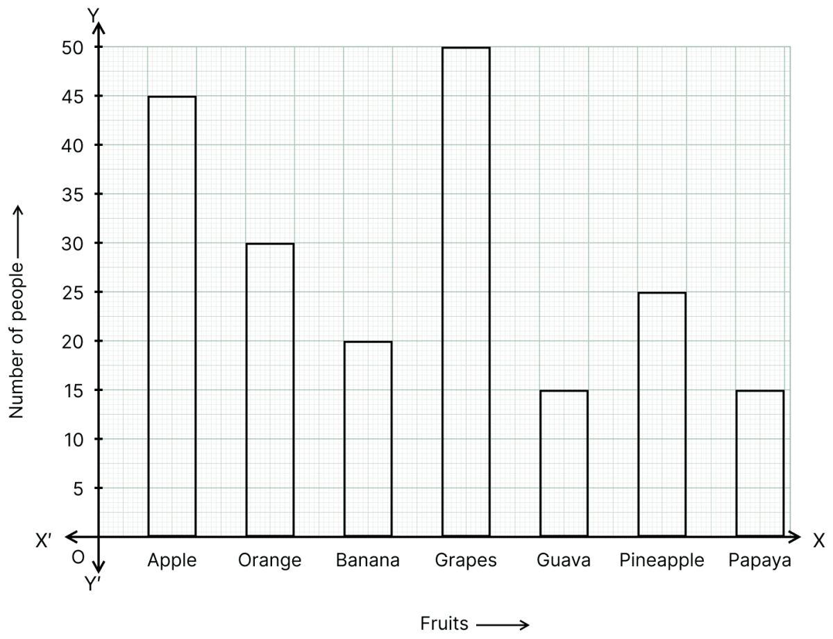
The result of a survey of 200 people about their favourite fruit is given below :
| Fruit | Number of people |
|---|---|
| Apple | 45 |
| Orange | 30 |
| Banana | 20 |
| Grapes | 50 |
| Guava | 15 |
| Pineapple | 25 |
| Papaya | 15 |
Represent the above data by a bar graph.
Answer
Steps:
On a graph paper, draw two mutually perpendicular lines OX and OY which intersect each other at point O. The line OX is taken horizontal and is called the x-axis, whereas the line OY is taken vertical and is called the y-axis.
On the x-axis, starting from O, mark points at equal distances. At these points write the names of the different fruits i.e. Apple, Orange, Banana, Grapes, Guava, Pineapple and Papaya.
Along y-axis, mark the heights of the bars (rectangles) in proportion to the given data (number of people). Here, take 1 cm on the y-axis = 5 people.
The required bar graph is as given below:
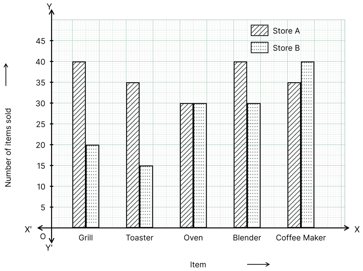
Mr Khurana has two kitchen appliance stores. He compares the sales of two stores during a month and recovered as given below:
| Item | Number of items sold — Store A | Number of items sold — Store B |
|---|---|---|
| Grill | 40 | 20 |
| Toaster | 35 | 15 |
| Oven | 30 | 30 |
| Blender | 40 | 30 |
| Coffee maker | 35 | 40 |
Represent the above data by a double bar graph.
Answer
Steps:
On a graph paper, draw two mutually perpendicular lines OX and OY which intersect each other at point O. The line OX is taken horizontal and is called the x-axis, whereas the line OY is taken vertical and is called the y-axis.
On the x-axis, starting from O, mark points at equal distances. At these points write the names of the different items i.e. Grill, Toaster, Oven, Blender and Coffee maker.
Along y-axis, mark the heights of the bars (rectangles) in proportion to the given data (number of items sold in Store A and Store B). Here, take 1 cm on the y-axis = 5 items.
For each item, draw two bars side by side — one for Store A and the other for Store B — and shade them with two different colours/designs. Show the meaning of the two shadings in an index.
The required double bar graph is as given below:
Given a bar graph:
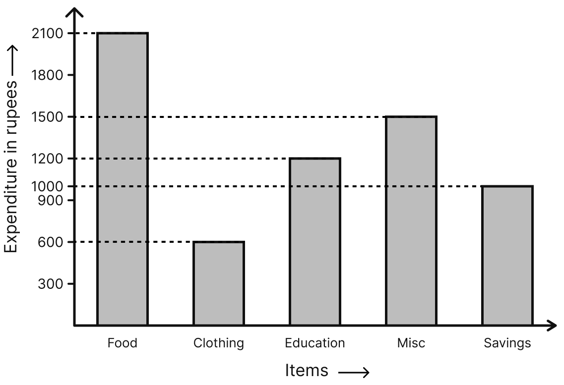
Read the bar graph carefully and answer the following questions:
(i) What is the information given by the bar graph?
(ii) On which item the expenditure is maximum?
(iii) On which item the expenditure is minimum?
(iv) State whether true or false:
Expenditure on education is twice the expenditure on clothing.
Answer
(i) The bar graph shows the expenditure (in ₹) of a monthly salary under different heads, namely Food, Clothing, Education, Misc and Savings.
Hence, the bar graph is representing the expenditure of monthly salary in different heads.
(ii) From the bar graph,
Expenditure on Food = ₹ 2,100
Expenditure on Clothing = ₹ 600
Expenditure on Education = ₹ 1,200
Expenditure on Misc = ₹ 1,500
Expenditure on Savings = ₹ 1,000
The tallest bar is that of Food.
Hence, the expenditure is maximum on food.
(iii) The shortest bar is that of Clothing.
Hence, the expenditure is minimum on clothing.
(iv) Expenditure on education = ₹ 1,200 and expenditure on clothing = ₹ 600.
⇒ 2 × Expenditure on clothing = 2 × 600 = ₹ 1,200 = Expenditure on education
Hence, the given statement is true.
Given a double bar graph.
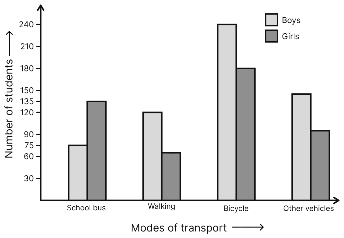
Read the double bar graph carefully and answer the following questions:
(i) What is the information given by the double graph?
(ii) Which mode of transport girls using more than the boys?
(iii) Which mode of transport boys using the most?
(iv) In which mode of transport number of girls is half the number of boys?
Answer
From the double bar graph,
| Mode of transport | Number of boys | Number of girls |
|---|---|---|
| School bus | 75 | 135 |
| Walking | 120 | 60 |
| Bicycle | 240 | 180 |
| Other vehicles | 150 | 90 |
(i) The double bar graph compares, for each mode of transport, the number of boys with the number of girls.
Hence, the double bar graph is representing the number of boys and girls using different modes of transport for going to school.
(ii) The number of girls is more than the number of boys only where the girls' bar is taller than the boys' bar, that is for School bus (135 > 75).
Hence, girls use the school bus more than the boys.
(iii) Among the boys' bars, the tallest bar is that of Bicycle (240).
Hence, boys use the bicycle the most.
(iv) For Walking, number of boys = 120 and number of girls = 60.
⇒ Half the number of boys = = 60 = Number of girls
Hence, in walking the number of girls is half the number of boys.
Using class intervals 0-5, 5-10, ..... construct the frequency distribution table for the following data:
13, 6, 12, 9, 11, 14, 2, 8, 18, 16, 9, 13, 17, 11, 19, 6, 7, 12, 22, 21, 18, 1, 8, 12, 18.
Answer
Here, the maximum value = 22 and the minimum value = 1.
∴ Range = 22 - 1 = 21
Taking the class intervals 0-5, 5-10, 10-15, 15-20 and 20-25, each of size 5, the frequency distribution table of the given data is:
| Class interval | Tally marks | Frequency |
|---|---|---|
| 0-5 | II | 2 |
| 5-10 | 7 | |
| 10-15 | 8 | |
| 15-20 | 6 | |
| 20-25 | II | 2 |
| Total | 25 |
Hence, the required frequency distribution table is as given above.
Given below are the marks secured by 35 students in a surprise test:
41, 32, 35, 21, 11, 47, 42, 00, 05, 18, 25, 24, 29, 38, 30, 04, 14, 24, 34, 44, 48, 33, 36, 38, 41, 48, 08, 34, 39, 11, 13, 27, 26, 43, 03
Taking class intervals 0-10, 10-20, ..... construct frequency distribution table. Find the number of students obtaining below 20 marks.
Answer
Here, the maximum value = 48 and the minimum value = 0.
∴ Range = 48 - 0 = 48
Taking the class intervals 0-10, 10-20, 20-30, 30-40 and 40-50, each of size 10, the frequency distribution table of the given data is:
| Classes | Tally marks | Frequency |
|---|---|---|
| 0-10 | 5 | |
| 10-20 | 5 | |
| 20-30 | 7 | |
| 30-40 | 10 | |
| 40-50 | 8 | |
| Total | 35 |
The students obtaining below 20 marks are the students of the classes 0-10 and 10-20.
∴ Number of students obtaining below 20 marks = 5 + 5 = 10
Hence, 10 students obtained below 20 marks.
Draw a histogram for the following frequency table.
| Classes | Frequency |
|---|---|
| 50-60 | 2 |
| 60-70 | 6 |
| 70-80 | 5 |
| 80-90 | 8 |
| 90-100 | 5 |
| 100-110 | 7 |
| 110-120 | 3 |
| 120-130 | 4 |
| Total | 40 |
Answer the following questions:
(i) Which group has the maximum number of houses?
(ii) How many houses pay less than ₹ 100?
(iii) How many houses pay ₹ 100 or more?
Answer
Steps:
Since the scale on the x-axis starts at 50, a break (kink) is shown near the origin along the x-axis to indicate that the graph is drawn to scale beginning at 50 and not at the origin itself.
Take 1 cm on the x-axis = 10 units (electricity bill in ₹).
Take 1 cm on the y-axis = 1 house.
Construct rectangles corresponding to the given data. As the data is grouped, the rectangles are drawn adjacent to one another with no gap in between.
The required histogram is as given below:

(i) The highest rectangle corresponds to the maximum number of houses (i.e. 8), which lies in the class interval 80-90.
Hence, the group 80-90 has the maximum number of houses.
(ii) The houses paying less than ₹ 100 are the houses of the classes 50-60, 60-70, 70-80, 80-90 and 90-100.
∴ Number of houses paying less than ₹ 100 = 2 + 6 + 5 + 8 + 5 = 26
Hence, 26 houses pay less than ₹ 100.
(iii) The houses paying ₹ 100 or more are the houses of the classes 100-110, 110-120 and 120-130.
∴ Number of houses paying ₹ 100 or more = 7 + 3 + 4 = 14
Hence, 14 houses pay ₹ 100 or more.
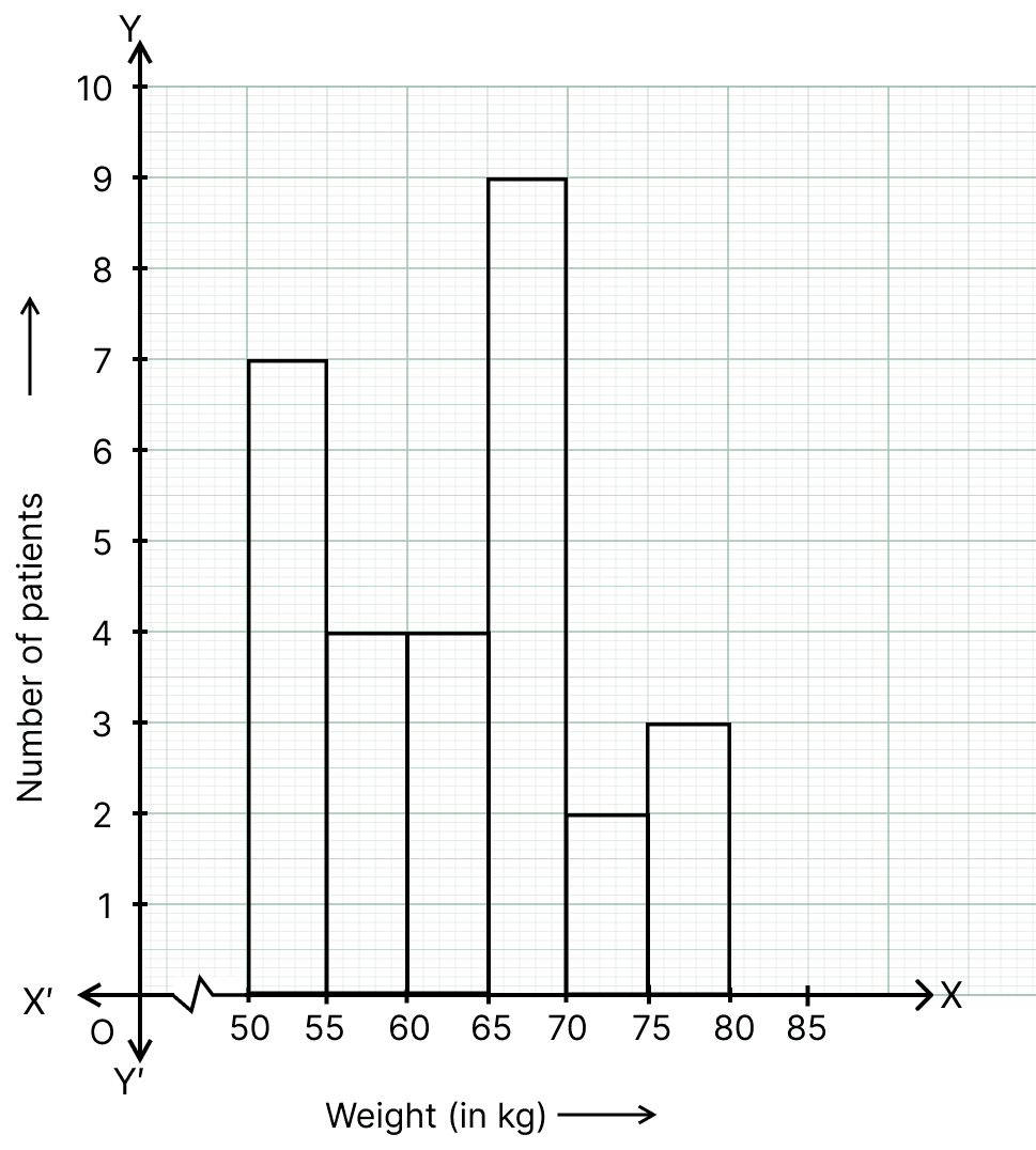
The weights of 29 patients in a hospital were recorded as follows:
| Weight (in kg) | Number of patients |
|---|---|
| 50-55 | 7 |
| 55-60 | 4 |
| 60-65 | 4 |
| 65-70 | 9 |
| 70-75 | 2 |
| 75-80 | 3 |
Draw a histogram to represent this data visually.
Answer
Steps:
Since the scale on the x-axis starts at 50, a break (kink) is shown near the origin along the x-axis to indicate that the graph is drawn to scale beginning at 50 and not at the origin itself.
Take 1 cm on the x-axis = 5 units (weight in kg).
Take 1 cm on the y-axis = 1 patient.
Construct rectangles corresponding to the given data. As the data is grouped, the rectangles are drawn adjacent to one another with no gap in between.
The required histogram is as given below:
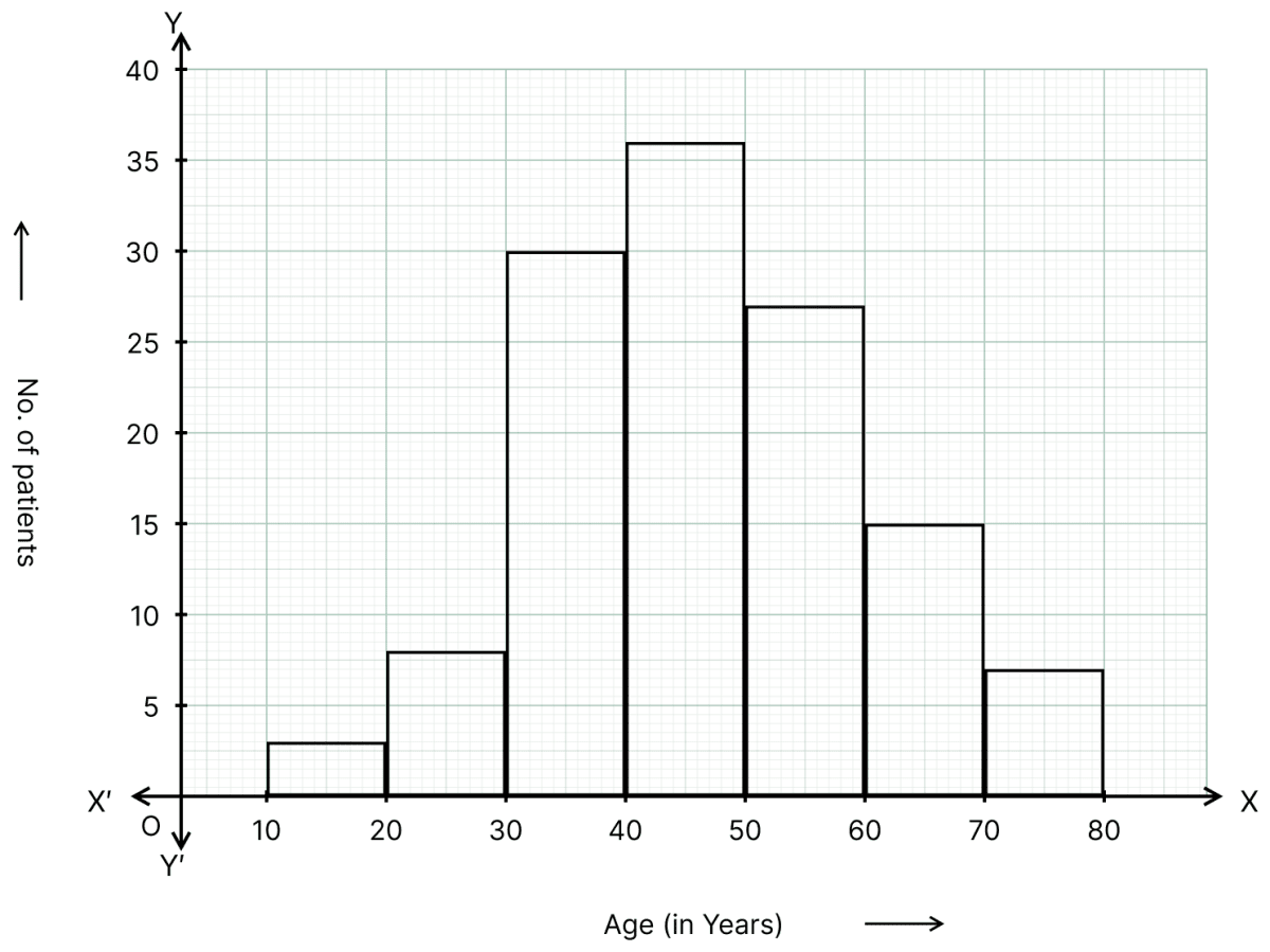
In a study of diabetic patients, the following data was obtained:
| Age (in years) | No. of patients |
|---|---|
| 10-20 | 3 |
| 20-30 | 8 |
| 30-40 | 30 |
| 40-50 | 36 |
| 50-60 | 27 |
| 60-70 | 15 |
| 70-80 | 6 |
Represent the above data by a histogram.
Answer
Steps:
Take 1 cm on the x-axis = 10 units (age in years).
Take 1 cm on the y-axis = 5 patients.
Construct rectangles corresponding to the given data. As the data is grouped, the rectangles are drawn adjacent to one another with no gap in between.
The required histogram is as given below:
The histogram showing the daily wages (in ₹) of workers in a farm is given alongside.
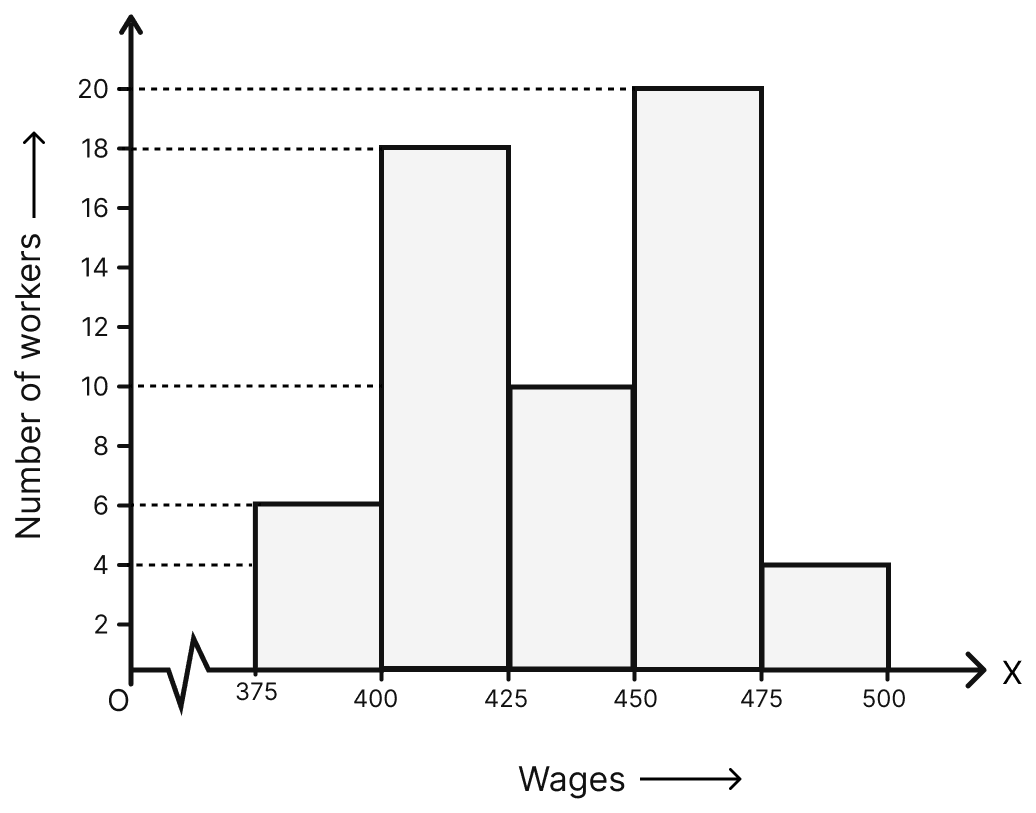
Answer the following:
(i) What is the frequency of class 400-425?
(ii) What is the class having minimum frequency?
(iii) How many workers get more than ₹425?
(iv) How many workers get less than ₹475?
(v) Number of workers whose daily wages are more than or equal to ₹400 but less than ₹450.
Answer
From the histogram,
| Wages (in ₹) | Number of workers |
|---|---|
| 375-400 | 6 |
| 400-425 | 18 |
| 425-450 | 10 |
| 450-475 | 20 |
| 475-500 | 4 |
(i) The height of the rectangle over the class 400-425 is 18.
Hence, the frequency of the class 400-425 is 18.
(ii) The shortest rectangle is the one over the class 475-500, whose height is 4.
Hence, the class 475-500 has the minimum frequency.
(iii) The workers getting more than ₹ 425 are the workers of the classes 425-450, 450-475 and 475-500.
∴ Number of workers getting more than ₹ 425 = 10 + 20 + 4 = 34
Hence, 34 workers get more than ₹ 425.
(iv) The workers getting less than ₹ 475 are the workers of the classes 375-400, 400-425, 425-450 and 450-475.
∴ Number of workers getting less than ₹ 475 = 6 + 18 + 10 + 20 = 54
Hence, 54 workers get less than ₹ 475.
(v) The workers whose daily wages are more than or equal to ₹ 400 but less than ₹ 450 are the workers of the classes 400-425 and 425-450.
∴ Required number of workers = 18 + 10 = 28
Hence, 28 workers have daily wages more than or equal to ₹ 400 but less than ₹ 450.
The number of hours for which students of a particular class watched television during holidays is shown in the histogram alongside.
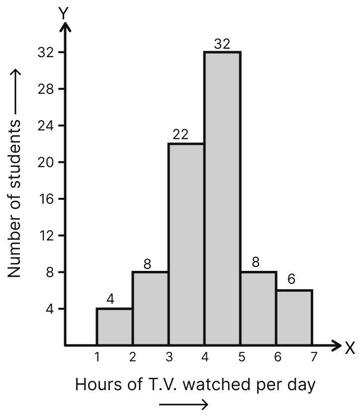
Answer the following:
(i) For how many hours did the maximum number of students watch T.V.?
(ii) How many students watched T.V. for less than 4 hours?
(iii) How many students spent more than 5 hours in watching T.V.?
(iv) How many students spent more than 2 hours but less than 4 hours in watching T.V.?
Answer
From the histogram,
| Hours of T.V. watched per day | Number of students |
|---|---|
| 1-2 | 4 |
| 2-3 | 8 |
| 3-4 | 22 |
| 4-5 | 32 |
| 5-6 | 8 |
| 6-7 | 6 |
(i) The highest rectangle corresponds to the maximum number of students (i.e. 32), which lies in the class interval 4-5.
Hence, the maximum number of students watched T.V. for 4-5 hours.
(ii) The students watching T.V. for less than 4 hours are the students of the classes 1-2, 2-3 and 3-4.
∴ Required number of students = 4 + 8 + 22 = 34
Hence, 34 students watched T.V. for less than 4 hours.
(iii) The students spending more than 5 hours are the students of the classes 5-6 and 6-7.
∴ Required number of students = 8 + 6 = 14
Hence, 14 students spent more than 5 hours in watching T.V.
(iv) The students spending more than 2 hours but less than 4 hours are the students of the classes 2-3 and 3-4.
∴ Required number of students = 8 + 22 = 30
Hence, 30 students spent more than 2 hours but less than 4 hours in watching T.V.