
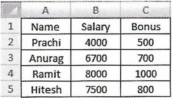
Computer Applications
A 3D line chart on Employee Payroll System is given below. Apply the following formatting effects to the chart:
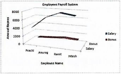
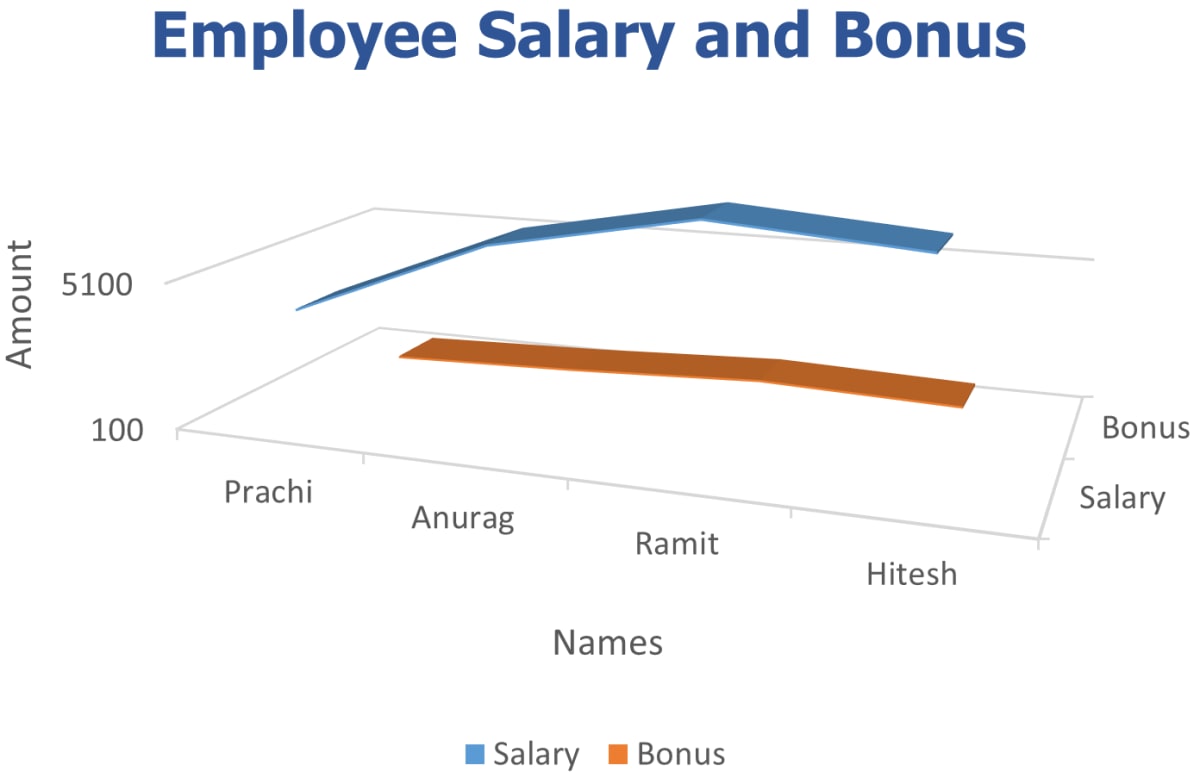
(i) Change the Chart Title to 'Employee Salary and Bonus'.
(ii) Change the title of X axis to 'Names' and Y axis to 'Amount'.
(iii) Change the Font of Chart Title to 'Tahoma', Font size as 16, Font style as Bold and Font color as blue.
(iv) Change the scale for Y axis and display the values between 100 to 8500.
MS Excel
1 Like
Answer
(i) We can follow the given steps to change the chart title:
Step 1 — Double-click on the chart title.
Step 2 — A textbox appears around the title.
Step 3 — Delete the previous title and type 'Employee Salary and Bonus' in the text box.
Step 4 — Click outside the chart area and the Chart Title will be changed.
(ii) We can follow the given steps to change the title of X axis:
Step 1 — Double-click on the title of X axis.
Step 2 — A textbox appears around the title.
Step 3 — Delete the previous title and type 'Names' in the text box.
Step 4 — Click outside the chart area and the title of X axis will be changed.
Similarly, the title of Y-axis can be changed by clicking on the title of Y axis and replacing the previous title with 'Amount' in the text box.
(iii) We can follow the given steps to format the Chart Title:
Step 1 — Click on the chart title and select it.
Step 2 — Go to the 'Home' tab on the Excel ribbon.
Step 3 — Use the Font options to change the font to 'Tahoma', size to 16, style to Bold, and color to blue.
(iv) We can follow the given steps to change the scale for Y axis and display the values between 100 to 8500:
Step 1 — Click on the chart to select it.
Step 2 — Point the mouse at Y-axis. Right-click on it and select the Format Axis option from the Shortcut menu.
Step 3 — The Format Axis dialog box will open. The Axis Options tab is selected by default. Click on the Fixed radio button for Minimum field and enter 100 in the text box.
Step 4 — Similarly, enter 8500 in the text box of the Maximum field. Click on Close button. The scale on the chart changes accordingly.
Answered By
2 Likes
Related Questions
Describe the text formatting features of MS Excel and how are these useful.
A chart displaying the subject wise attendance of four students and its source data have been given to you. Answer the following questions based on them:
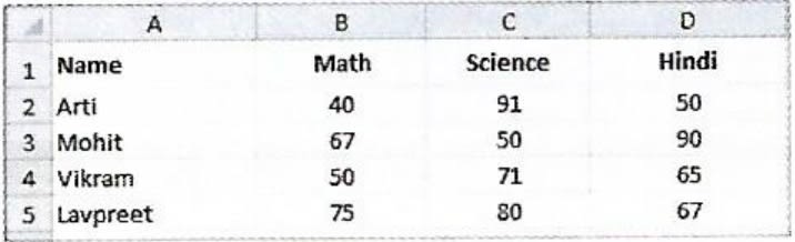
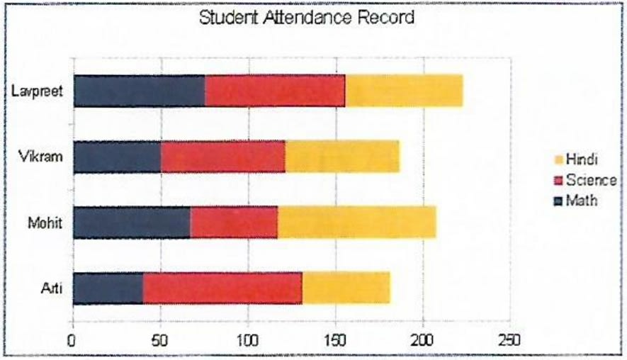
(i) Identify the Type of chart.
(ii) What is the title of the chart?
(iii) List the cell references of the three cell ranges used to produce this chart.
(iv) Suggest a suitable label for both category axis and value axis.
A table containing descriptions of different types of charts is given below. Names of some charts are given below within the bracket. Fill them in front of their respective descriptions and complete the assignment.
[Stock, Area, Bar, Pie, Line, and Radar]
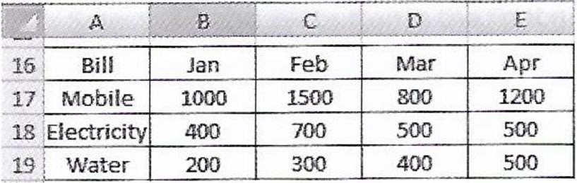
Name Description It displays data in the form of long rectangular rods also called bars. This chart displays data in the form of a circle. It emphasizes the magnitude i.e., the volume of change over time. It is designed specifically for plotting data values related to stocks and shares. It is in the form of lines and is used to illustrate trends in data at equal intervals. It is a type of chart that resembles a spider net. An Area chart depicting the trends in Bills over different months is shown along with its source data. Apply the formatting effects given below to the Area chart then print this chart along with the worksheet data.
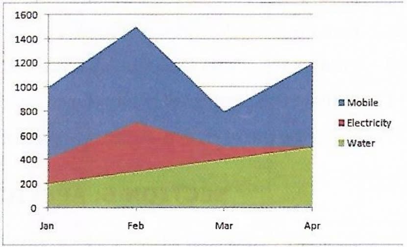
(i) Apply a border to the Chart area and also apply a background color of your choice.
(ii) Using the Gradient Fill option, set the background for the Plot area as 'Moss'.
(iii) Apply a border to the Legend and position it at the bottom of the chart.